After the many comments and compliments that I received on a recent post in the FujiLove Facebook group I thought I’d expand on my processing techniques and dispel a few myths. Here are my thoughts on making monochrome portraits from RAF raw files. I use Lightroom for my processing but I’m sure Luminar, Capture One and Alien Skin all work well with RAFs too.
Get the images right in colour first
I have found that the best mono pictures are made from decent colour files. Even if the shot was taken with a black and white film simulation in camera, I let Lightroom build a colour preview image using the Fujifilm Pro Negative S film simulation. I’ve set this as a default film simulation to apply when any of my Fujifilm camera files are imported into Lightroom. (See one of the many YouTube videos for how to set defaults.) Once I have a full size preview I do any slider adjustments to the picture to make it as wonderful as I can. I will use selective tools like the radial tool and gradient tool to pull the shot into the best tonal shape. I find that I rarely have any peak white in my colour portrait shots as I try to never shoot the sky, etc. Landscapes are another matter and take more faffing to get them looking great.
Black and white conversion process
Once I’ve selected and tidied all the shots for a portrait shoot, including cropping them as required, I’ll choose ‘Select all’, enter Library (grid view mode) and create virtual copies. Without deselecting, I go back into Develop mode and choose a suitable Acros film simulation for the subject from the profile menu then sync the profile across the currently selected files. I then right arrow to each file in turn making tonal or profile changes as required.
Portrait film simulation choices
Acros G gives the most contrast in skin tones of all shades and I find it needs a boost in exposure of about +⅓ stop over the other options.
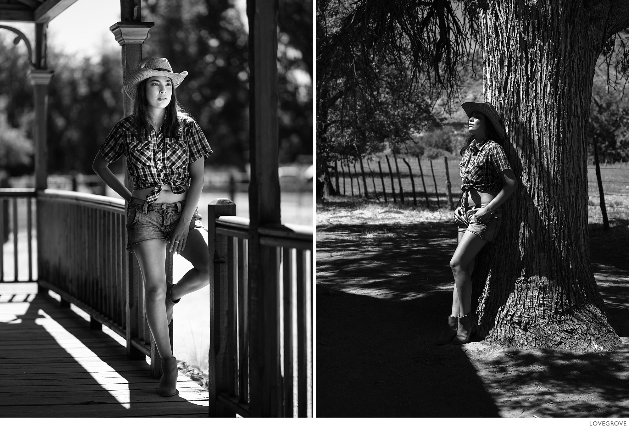
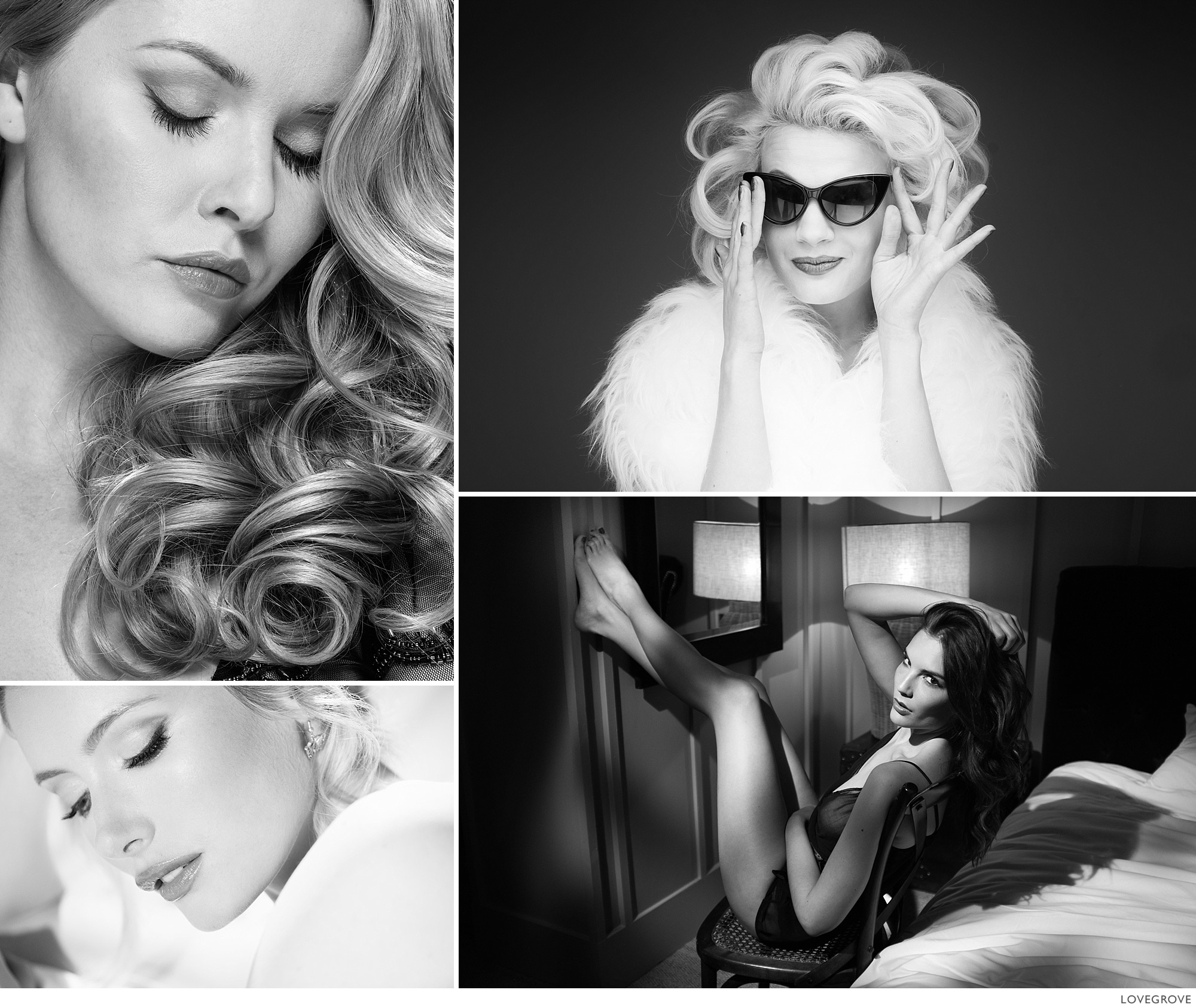
I used Acros G for these portraits and I went a bit mad with the contrast too. You just have to feel it. What is right for one image may not be alright for another.
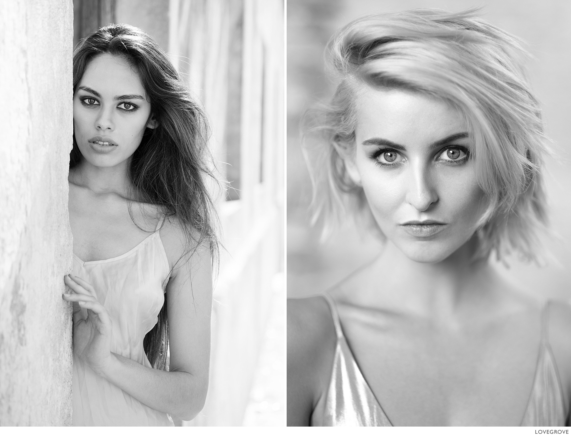
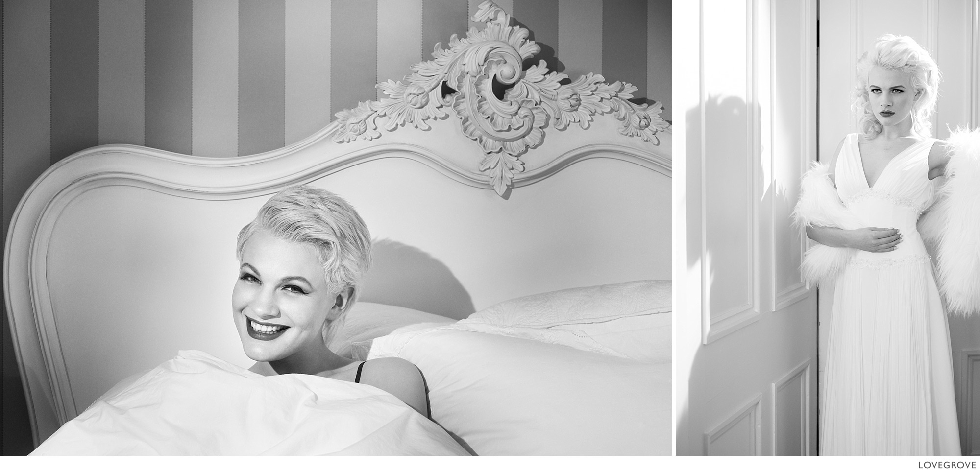
These were processed before Acros came on the scene and the treatment of highlight transition is quite different. The shot on the left from an X-Pro1 is flatter in the highlights but the shadows have more depth.
Landscape film simulation choices
If you have a blue or partly blue sky you might consider trying the Acros Y or the Acros R film profiles when switching to black and white using the system described above. The Y will give you a slightly more contrasty sky and the R will be more dramatic by far, deepening the blue considerably. If you want more control you can ignore Fujifilm’s profiles and switch to Black And White in Lightroom. You can then use the Black and White Mix sliders to set the look you like best. These settings can be saved in your own custom preset for recalling in the future.
Contrast matters
Tonal contrast is usually key to a picture’s success when converting to monochrome. Far more contrast is usually acceptable in a mono image than a colour one. The Contrast slider is usually adjusted with a view to setting the black point, the white point and the mid point contrast (or gamma). However, in reality it is far more involved than that. One of the first things I do when assessing my mono conversions is to pump up the mid tone contrast using the Contrast slider. Then I set the white point. Not all mono images need white but, with portraits, peak white in specular reflections in skin tones is a lovely thing to have. In a colour version of the same image the highlights at that level often look false because of colour suppression but, because we don’t see in black and white, the distortion in a mono image is usually fabulous. If you increase the contrast in a colour image, it increases the saturation too, and if you then go and reduce the saturation back to where it was before, the picture just looks wrong.
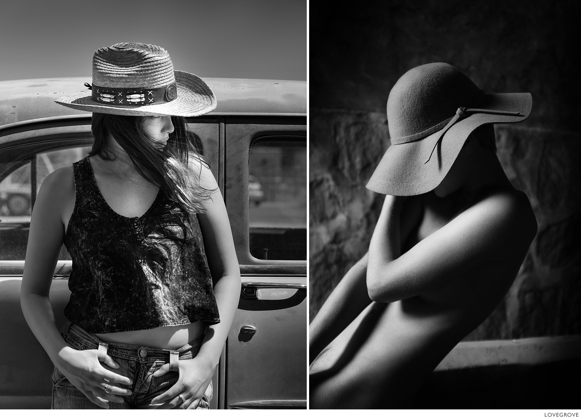
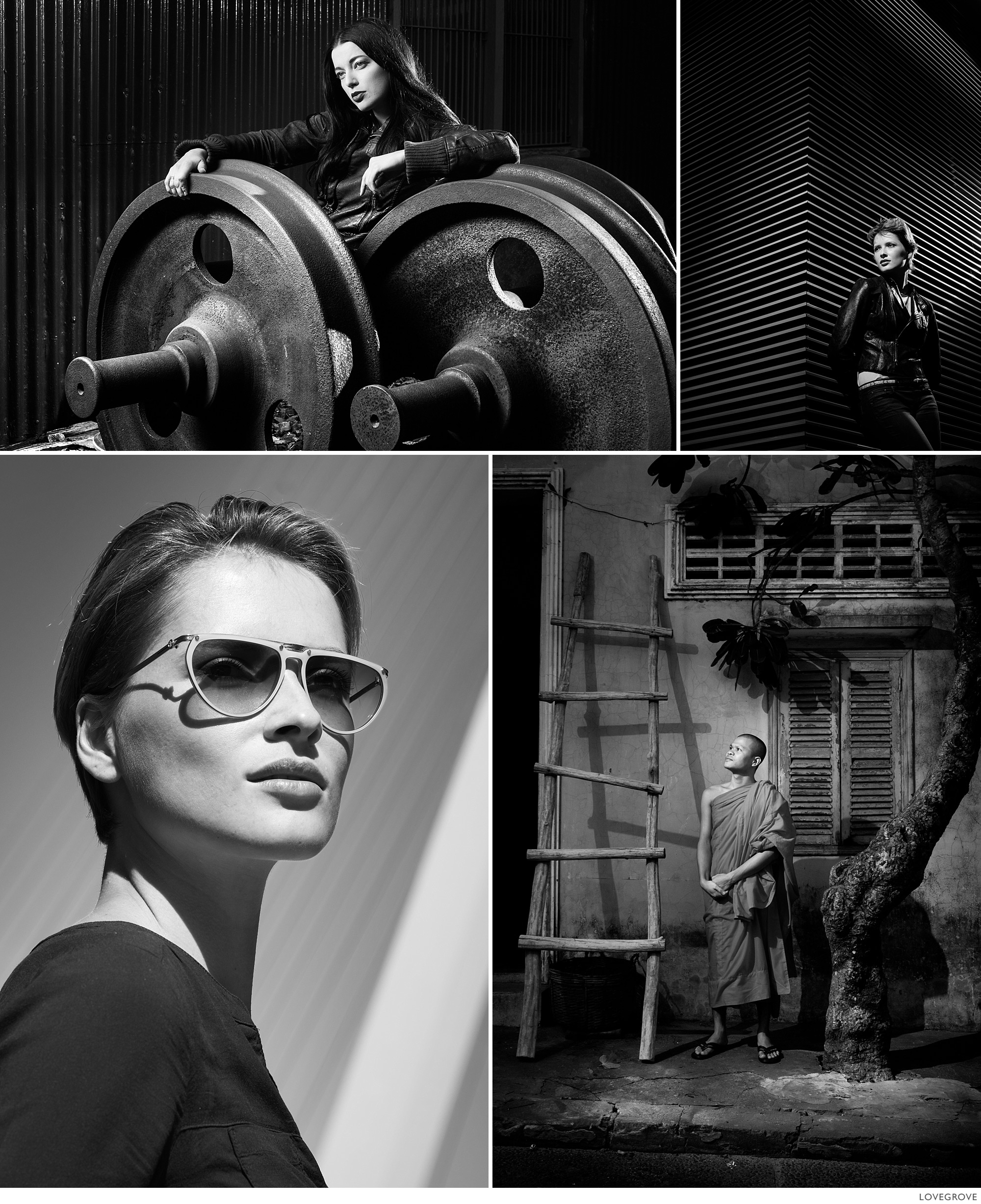
I used Acros R for the shot on the left and it set the sky tone dark but it also rendered the models lips light and her skin with low contrast. The shot on the right taken with the original X-100 was converted with the Black and White function in Lightroom.
White point
I use the Whites slider in Lightroom to pick up the top notes in the image. It has a overall linear effect giving greater contrast to the highlights before clipping them completely. Using the Highlights slider changes the shoulder point on the contrast curve and flattens out the tones at the top end. Once I got to know the difference between these two sliders, it empowered me to take control of the highlight detail and the white point in my monochrome images. These sliders are available in the selective tools as well including my two most used Radial tool and Gradient tool.
Unlike portraits, landscapes often need adjustments to the Highlights slider. In a landscape shot there is often far more contrast than we can easily control and occasionally some careful treatment to the sky is needed. Use the Highlights slider in a wedding shot however and a white silk dress can be reduced to grey cotton in no time. Highlights, like Clarity, is a slider to be very careful with.
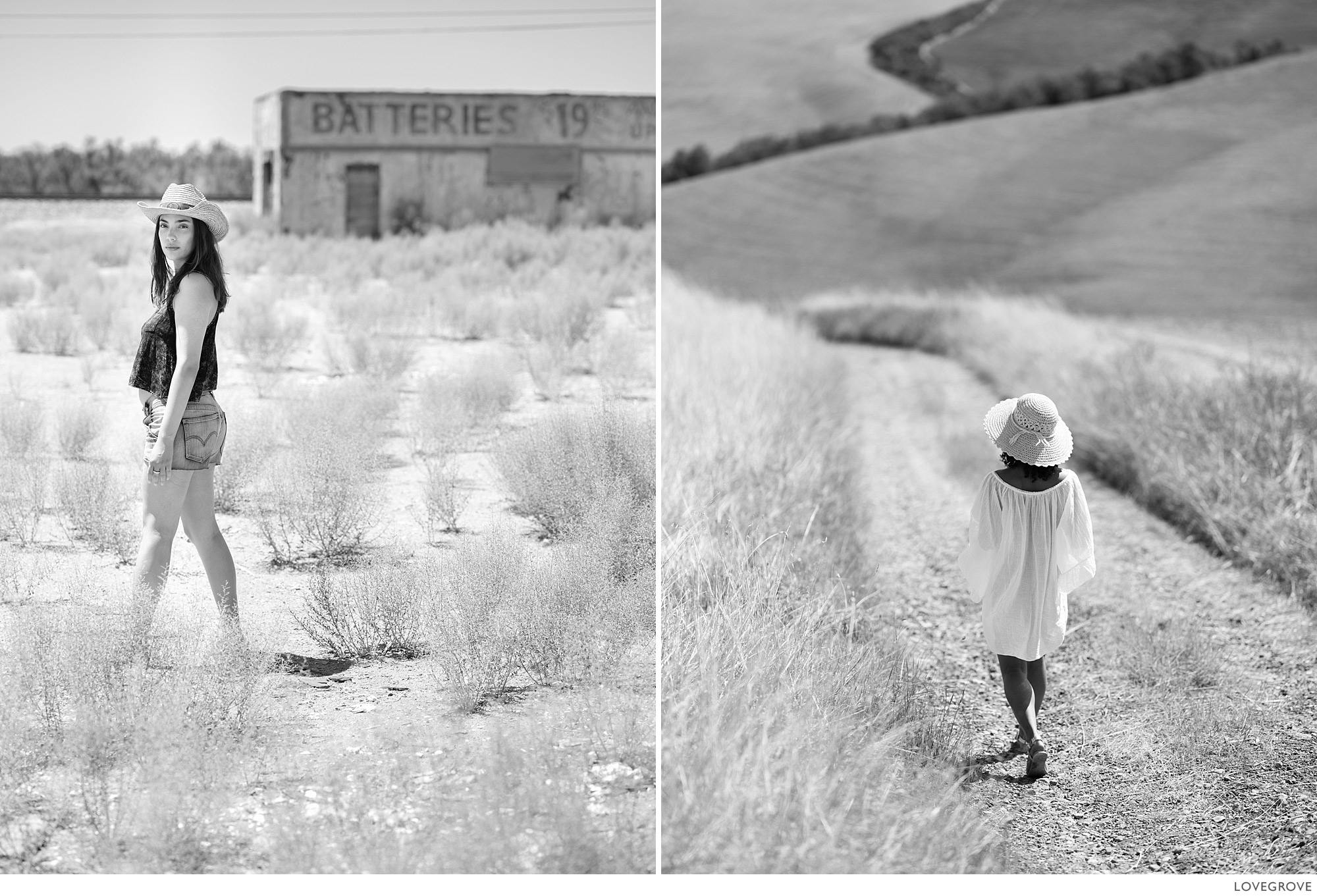
Highlight tones in landscapes can come from the ground too. Nothing says ‘hot’ quite like ground level highlights.
Black point
The Blacks slider acts differently in the basic tool set the way it does in the selective tools. In the selective tools like the Radial tool and Gradient tool it acts as a coarse lift to the absolute black point (a bit like sliding up the bottom point of the RGB curve) and I find this less useful than the way it behaves in the basic tool set. I tend to set my black level globally using the slider in the basic tool set and then make more use of the shadows slider in the selective tools.
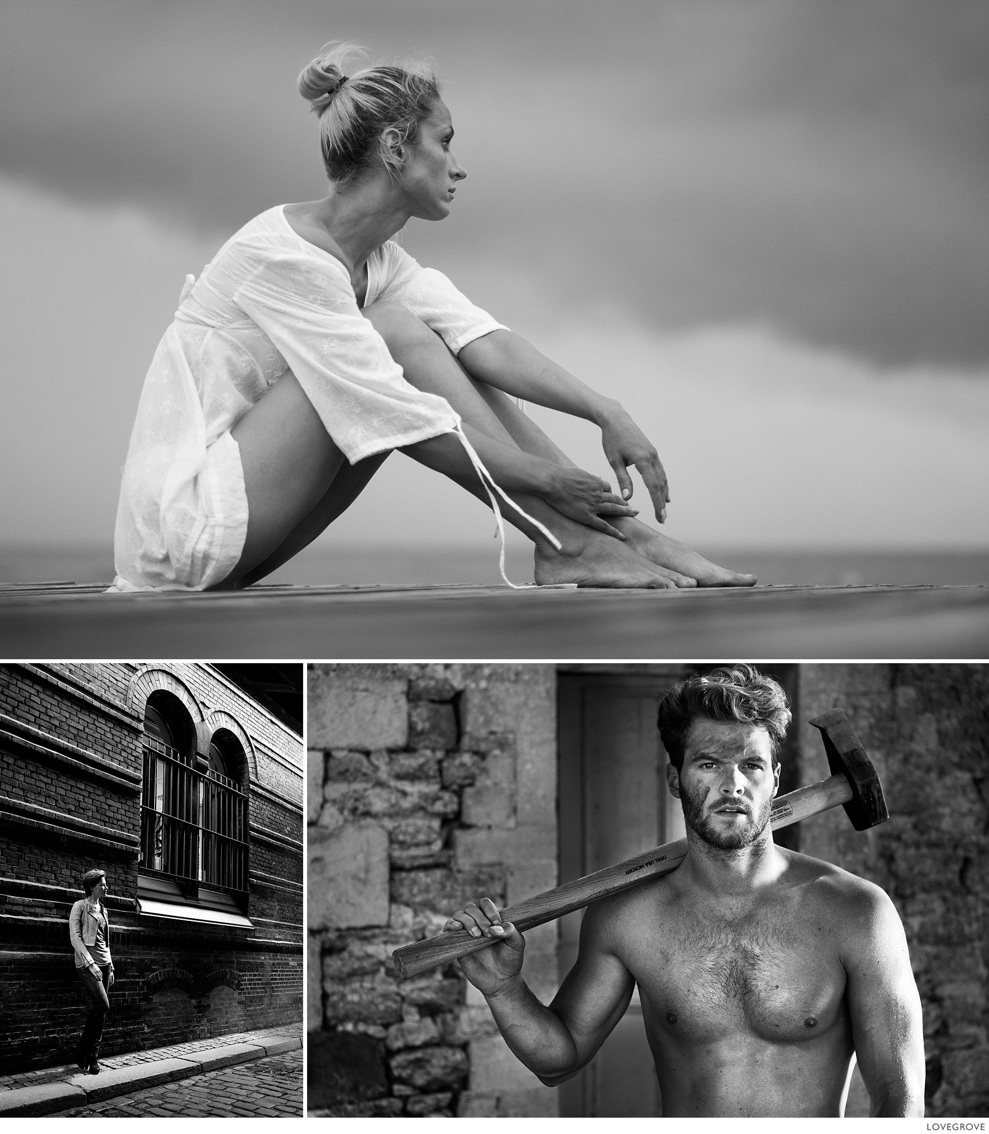
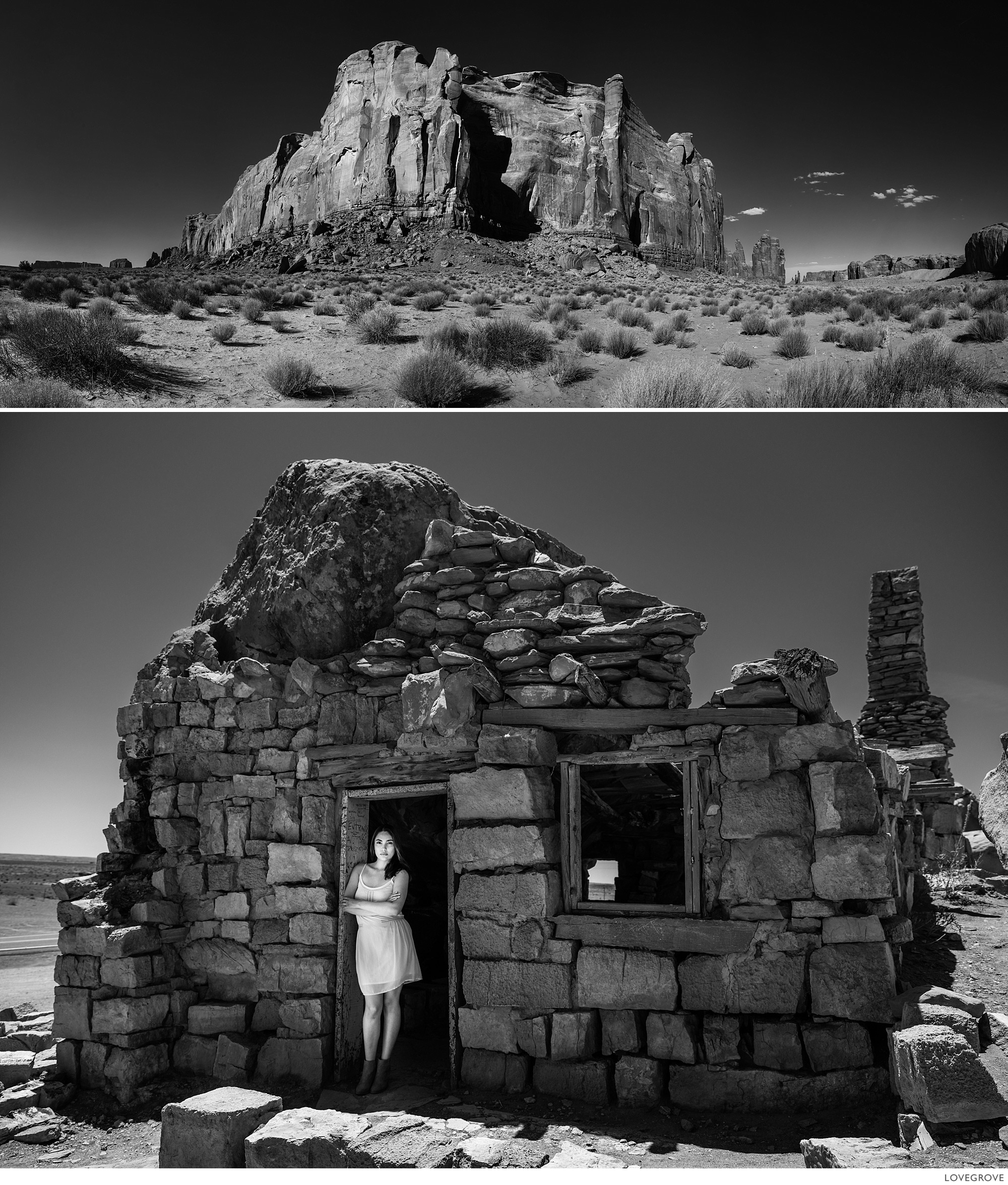
Top: If the sky is dark, make the most of it. I set the camera down on the jetty and used the flip out screen to ensure I got a dramatic shot. The processing was quite calm, giving lovely delicate transitions throughout the mid tones. The bottom shots are far more punchy and there are white tones in the files that weren’t there in the colour images.
I find that I end up juggling the Exposure slider and Whites slider to set the lower mid grey point. It sounds daft but it works for me.
There are times when Acros without any ‘filter’ works best and it is a safe default to use if you just want to batch process from colour without adding further adjustment. Older cameras like the X-Pro1 don’t have Acros options but don’t despair – the original Fujifilm Black and White profiles are just as good but slightly different.
These shots were all taken with Fujifilm cameras on my workshops and adventures. If you would like to join me, take a look here for more information.


