
This month’s title is a mouthful. I’m sorry for that, I spent quite some time trying to figure out a more elegant, informal, or funny way to put it. With no good outcome, as you can see. The topic, however, is quite important, and as a fact you can find tons of tutorials on how to edit your raw files on Lightroom so to be able to gain the best out of them on Photoshop. The reason why I’m here sharing my personal view and approach on the topic is that my presets are optimized for Fuji cameras, in particular for the new 24MPx sensor (I have the feeling that the old 16MPx is slightly different in the way it resolves dynamic range and details), something you readers of FujiLove might find interesting.
Yesterday morning I shot hundreds of pics at my last studio session with the beautiful Miriam. If I let Lightroom do the import his way, I am going to find hundreds of horribly converted raw files, because that’s how Lightroom likes to convert my Fuji files: horribly. It applies the pointless Adobe Standard preset on camera calibration, and leaves all the remaining settings blank. If I let Lightroom do what it likes to do, I would end up with images very very far from what I had in mind and from what I had seen on my EVF while shooting. Which has a double effect: first, I would get depressed like “a whole shooting session wasted on these horrible shots!”, secondly, I would have to spend a lot of time, after recovering from the initial depression, to apply a different preset to the shots I still find interesting despite the automatic Lightroom development.
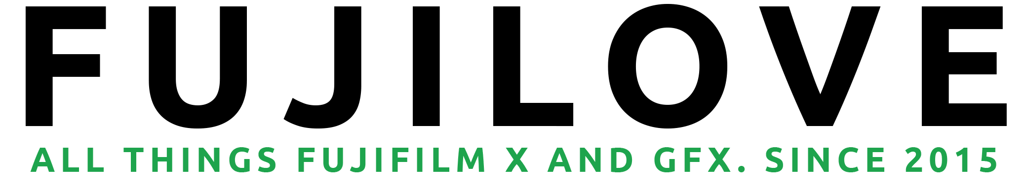
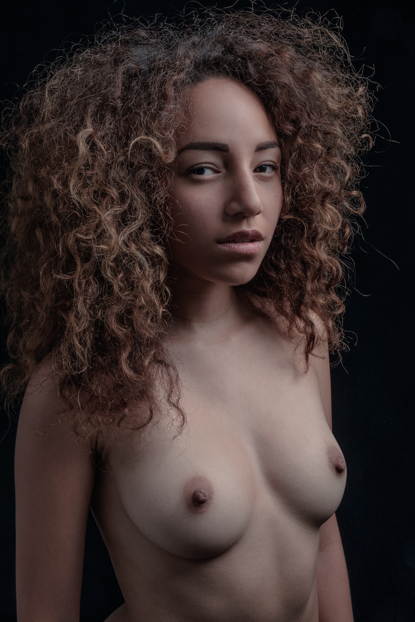
Here’s a shot of Miriam from the last session as it looks “developed” by Lightroom. This photo was obtained with the minimal set-up I described in a previous article, should you be interested in how I set the studio and the camera. I will develop this shot along the article so to show you the various steps.
To avoid all that drama, I created a few presets for my different studio sessions. I then ask Lightroom to apply the correct preset to the photos while importing them. It takes a little longer, but this way I end up with already good looking shots, good for proofing, even good for exporting and sharing with the client. In some circumstances, they are even good for delivery. Let’s see how they are done.
First of all, I change Adobe Standard into Camera Chrome in the Camera Calibration tools. There are a few other presets available, I just really love Camera Chrome. You can off course use different ones, but you should always start by choosing one before going on with the rest of your postproduction. The reason is that Camera Calibration presets alter the way the raw file renders colors and contrast, so it deeply affects the overall image and how all the other tools add up. Start with it, or you might risk to have to go back to the initial editing and re-do it all again. The reason why Adobe put this tool at the very bottom of the Development column stays a mystery.
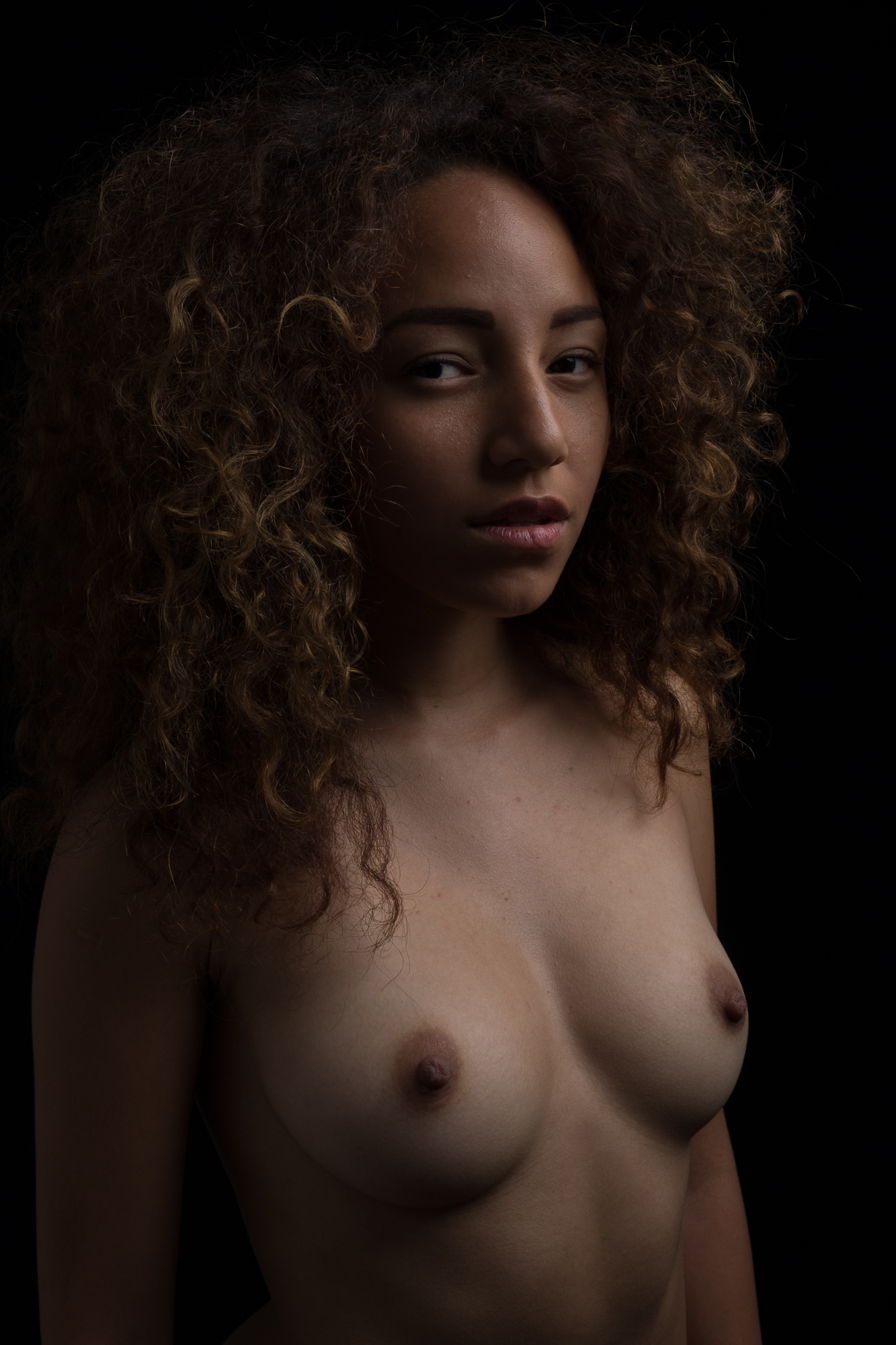
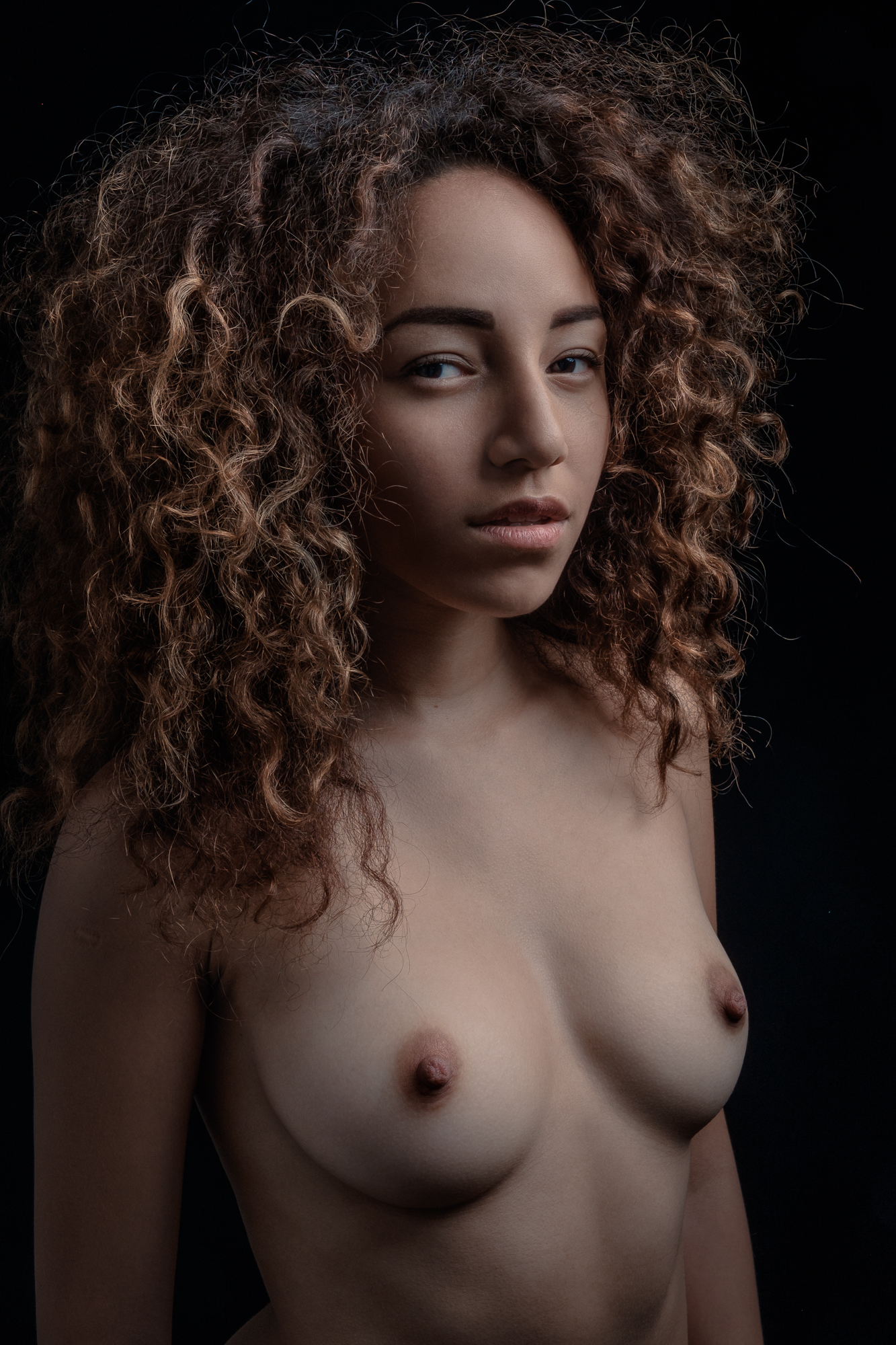
Then I go up one tool and add a bit of Post-Crop Vignetting (-15, 0, 100, 100, 100), I set the Sharpening (25, 1, 100, 0), I increase the luminance of the skin with the Luminance tool in the HSL tab (red +12, orange + 20, yellow +5), and finally work on the lights and contrast with the Basic tool (Contrast -25, Highlights -20, Shadows +30, Blacks +25, Clarity +14). Beware that this preset is tuned for my studio portrait sessions with the black background and the big white softbox. When I use other backgrounds or other light scheme I have other presets (or make new ones). Here you can see how Miriam’s picture looks like with this preset. It’s a whole different photo, IMHO.
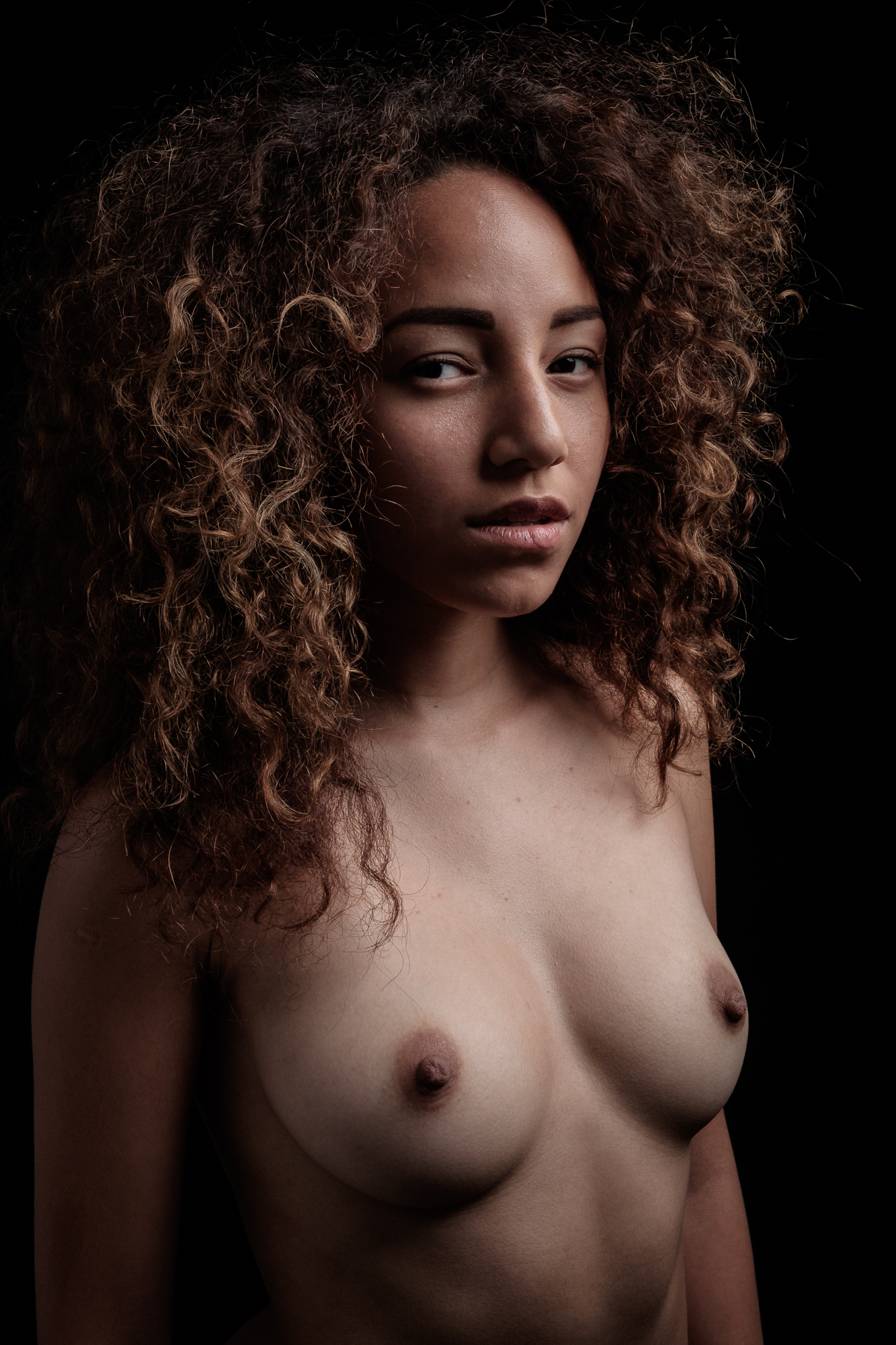
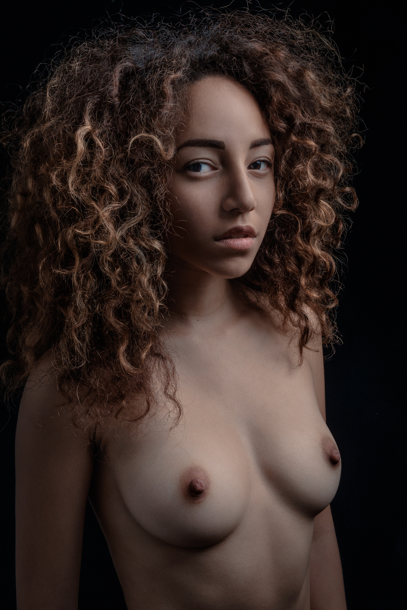
But the question is, is this photo “deliverable” as a final? As with all in life and in business, it really depends on the final use. However, I feel it is still pretty raw. Sure, Lightroom allows to tune all the settings more precisely and offers even brushes and gradients, so the photo can be improved without Photoshop. For example the skin can be softened a little bit, and the light on the chest can be reduced slightly to match the face (different tan amount), while the red in the face can be tuned towards a more orange hue with the Hue tool in the HSL tab (Red +16). Here’s the result.
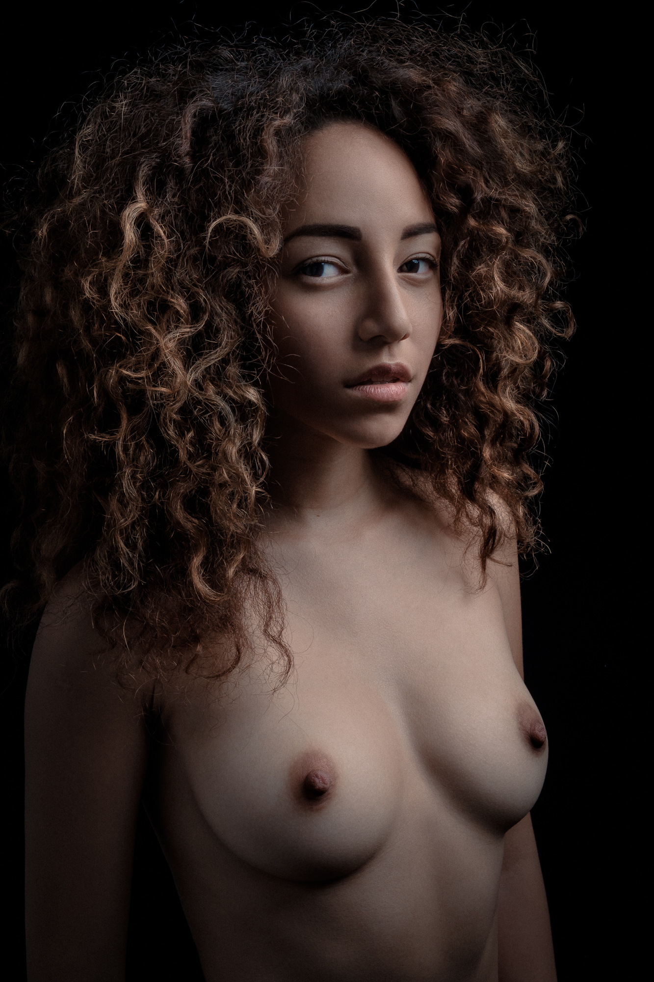
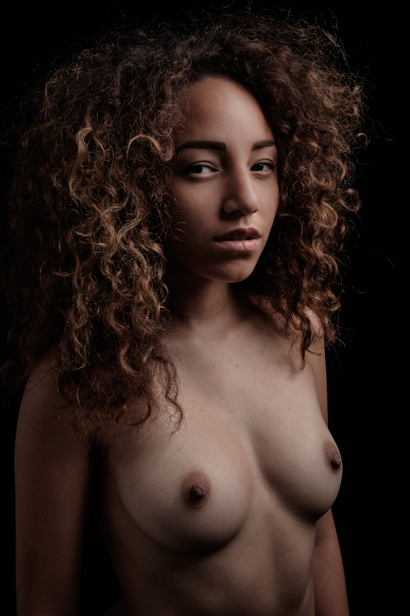 It’s more than OK, but Photoshop would give us way more control and options to get to a professional outcome. However, for as good as this preset may look, it is not good for Photoshop editing. The reason is that the preset is tuned to produce a “final looking” photo, while a photo going into Photoshop editing is not (and should not be) a final. If we want to be able to operate the best light, contrast, detail and color editing on Photoshop, we need a file that keeps as many “info” as possible, with no extremes. Technically, we need no dark shadows, no bright highlights, no harsh contrasts, and no vignetting. The latter is easy, just put a zero into the Post-Crop Vignetting, while I get all the other attributes by setting, into the Basic tab, a completely new set of values (Exposure +35, Contrast -50, Highlights -15, Shadows + 100, Blacks + 90, Clarity +15). The, as you can see, result is super open and super neutral.

I already went through my Photoshop workflow for portraits here on FujiLove a couple of years ago, and while the time has passed, my workflow stays basically the same. I start with the Frequency Separation (tons and tons of tutorials on YouTube, guys) to clean the skin and even the lights and shadows. A new thing I do, however, is to add an empty layer between the high and low frequency layers and use it to “paint” (with a normal brush) the shadows or the lights when the clone tool on the low frequency layer is not enough for the job. The Frequency Separation step is a long one (skin cleaning takes time, and the more it takes the better it looks) but is a major one: the skin smoothing brush or the heal/clone tool Lightroom will never get even close to the professional results you can get in Photoshop once you master the Frequency Separation.
After the Frequency Separation, I move into “brushing” lights, shadows and contrast directly on the shot. Most tutorials refer to this moment to “Dodge and Burn”, as it was called in the old days of film, and you can find a multitude of different ways to get the job done. Personally, I use a combination of curves, brightness and contrast, but whatever your approach is, please consider to do Dodge and Burn properly you need to be aware of how the light works on faces, as where the light should shine and where a shadow should be cast. My general advice is to to look at how professional Make Up artists work, because they basically do the same, but before a shooting instead of afterwards.

Then I work on the color correction. As with the Frequency Separation and the Dodge and Burn, you can find so many tutorials on Color Correction that you’ll never live long enough to watch them all, so I won’t get too technical. Let’s just say I use the Selective Color tool to reduce the cyan in the reds, then I use the Hue/Saturation tool to reduce the saturation of the reds while also correcting their hue, then I apply a personally designed Gradien Map, and that I finally apply a + 40 of Vibrance to let the final colors to pop up.
Finally, and only finally, I might use the Liquify. Sometimes I just use it to correct the “errors” in proportion introduced by the focal length. For example, in this case I shot with a 50mm equivalent, which enlarged slightly the head compared with the body because I shot slightly from above (which happens a lot with Miriam, since her nickname is mimismallmodel), so I used Liquify to reduce the size of the head, while adjusting mouth and chin accordingly, all without reducing the size of her eyes (I might have actually increased them a bit, sorry, I couldn’t resist). When to stop with the Liquify is a matter of personal taste and final use of the images. For a portfolio book, for example, I think the Liquify should be used only to correct proportions issues due to the lens and never to affect the real look of the subject, while for editorials I’m basically open to any amount of transformation as long as I like the result.
Once I finish with Photoshop I save the photo so I can find it back in Lightroom. Here I might tune it a little bit more before I deliver it. What I usually do is to apply a Post-Crop Vignetting (remember, I removed it before going in Photoshop), in this case a -18, 0, 100, 100, 100. Sometimes I add a bit of grain, like here, 19, 25, 50. Then I go to Basics and see if there are some general setting I need to tune. In this case I added a +20 of Highlights and reduced the Shadows to -100.
So, this is a fully developed photo from my latest studio portrait session with Miriam Herrera. I hope you like it! If you have any questions about any of the above steps, feel free to ask, either here in the comments section or by writing to me personally. On the other side, I would love to know if you do things differently. How do you prepare your photos for proofing, and how for your Photoshop editing? What tools do you usually use on Photoshop, and in which order? Let’s see some “before-after” pictures!