By now most photographers who have not been living under a rock have heard about Fujifilm’s legendary color and film simulations. We know what our cameras are capable, but for those looking to get out of the norm, looking to try something different: today’s post is for you.
As many of you will know if you follow my work, I have been on a bit of a tear with black and white photography over the last year. I developed a look that I liked and refined it into a style that people who knew me could recognise as mine. I used this for months but was ultimately bored with it in many respects, so I began to again experiment with color, looking to find ‘my look’ and I recently found what I think works for me.
Funny enough, I found it while looking at a tutorial on the Orange/Teal look, and it really got me thinking about how the colors and tones in my images were working together. I began experimenting and I found a variation of that ‘Orange/Teal’ look that really worked for me in my studio.
Given the nature of this style, it won’t work well in all situations (especially situations with lots of teal or orange) but in my relatively monochromatic studio space, with its fairly controlled light, and consistent look I have managed to get this look to work for me, and I am actually really loving it. So I wanted to share and take you all through it step by step.
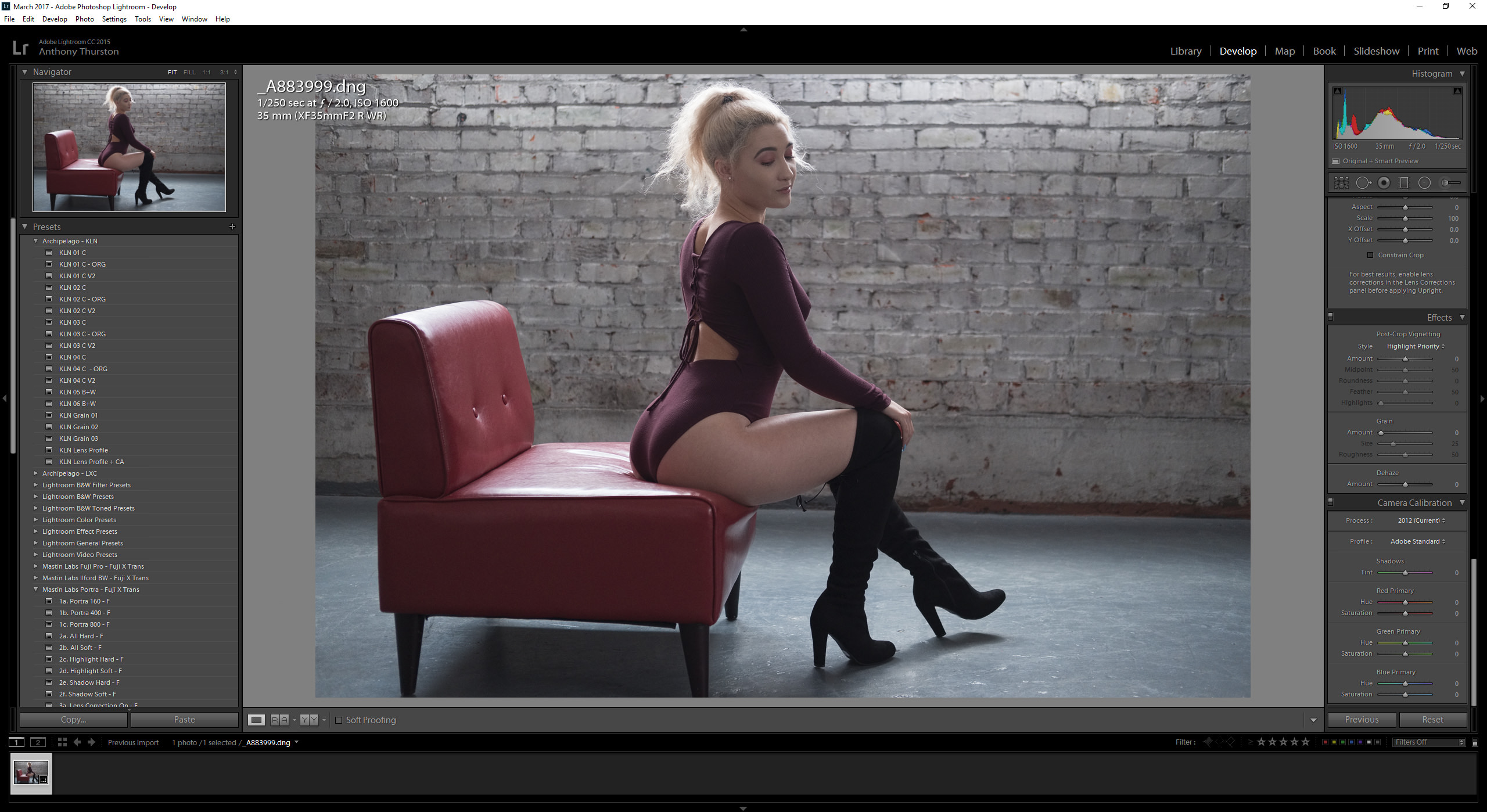
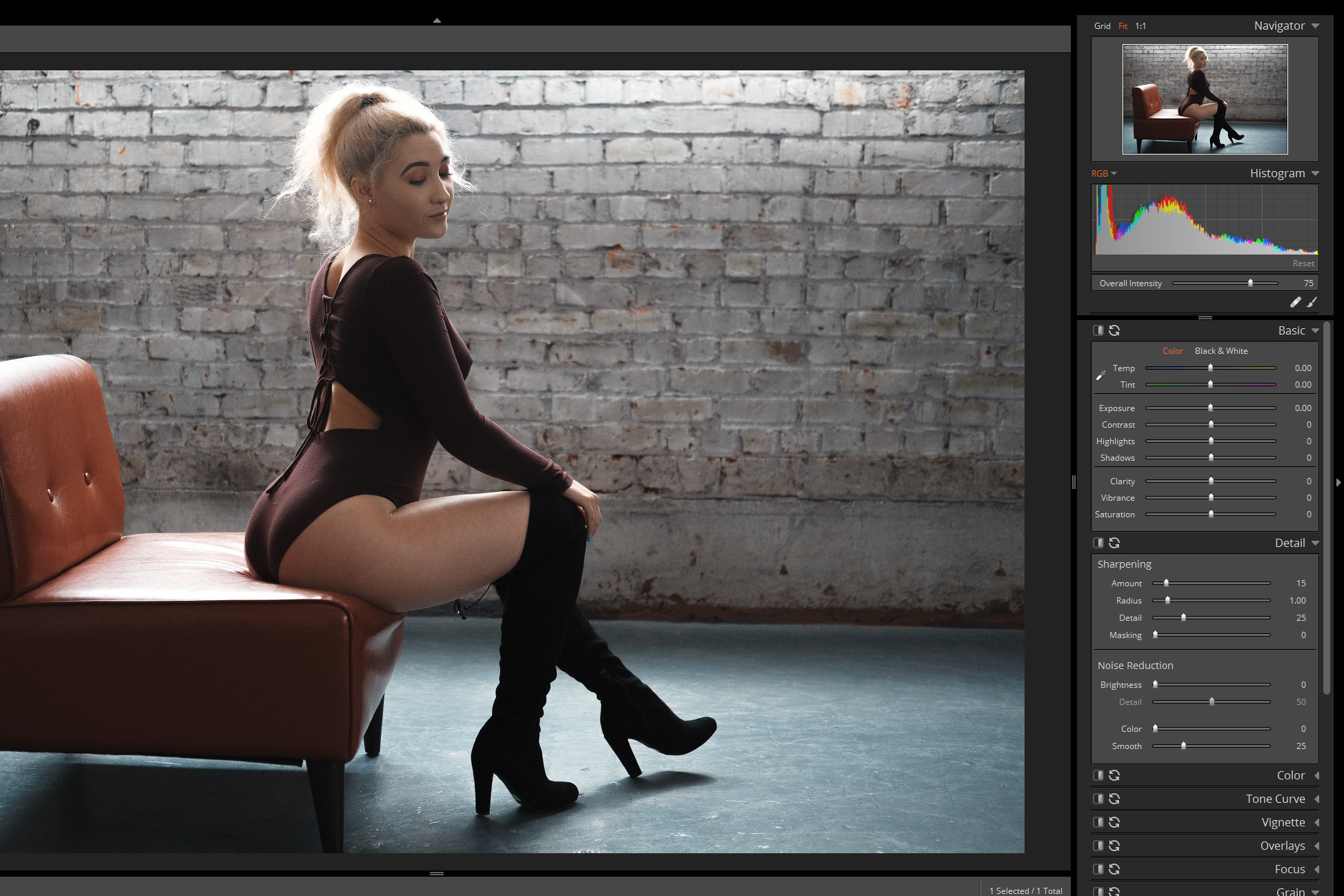
First, we need to open our RAW file. In my case, an image from my shoot yesterday, which has been converted to DNG with IridientTransformer (which also, by the way, was just updated to Beta 3).
Upon opening my file in Lightroom I head to the Camera Calibration section and set my profile to the Fujifilm ‘Pro Neg Std’ option.
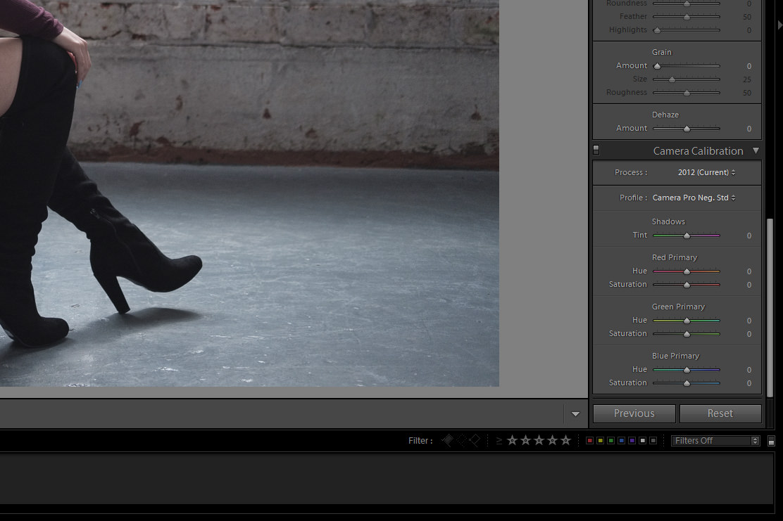
Then I go down to the hue sliders and I set my Red to +50 and my Blue to -100. This is the basis of the Orange/Teal look, and depending on the colors your subject is wearing, and of the scene, you are shooting them in, this may or may not work very well for you.
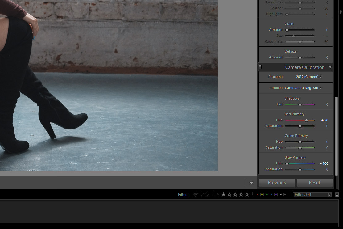
As you can see this has changed the blues in the floor and given her a nice (in my opinion) skin tone. But the look, at least my variation of it, is not done yet. Now I head up to the tone curve and sliders to make some adjustments.
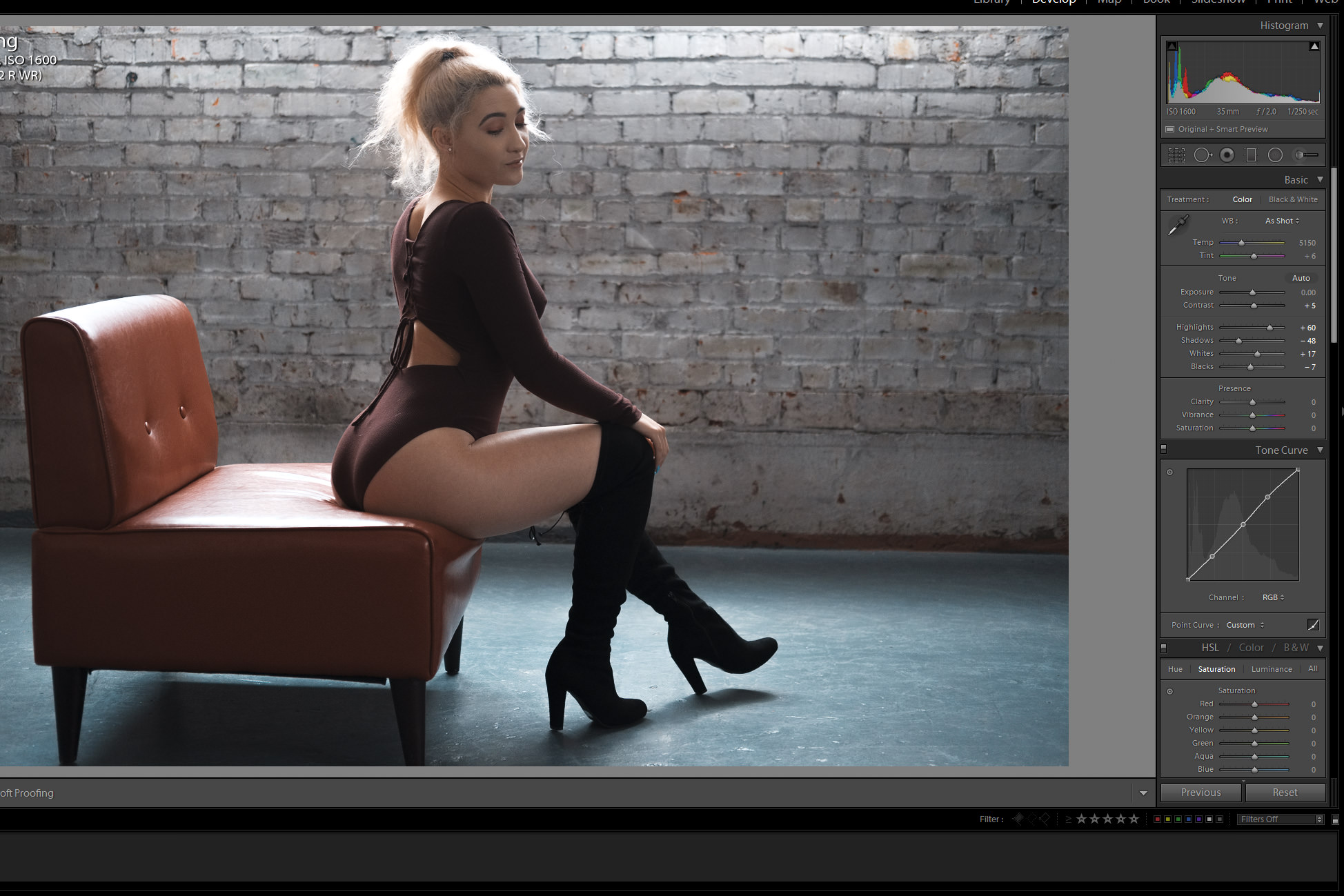
These adjustments vary slightly from image to image, but the effect is the same. To bring back a little contrast and give the image the darker, moodier look that I am known for. Now that we have the image in a good place, now I take the image over to Alien Skin Exposure X2 (ASE X2) for the finishing touches.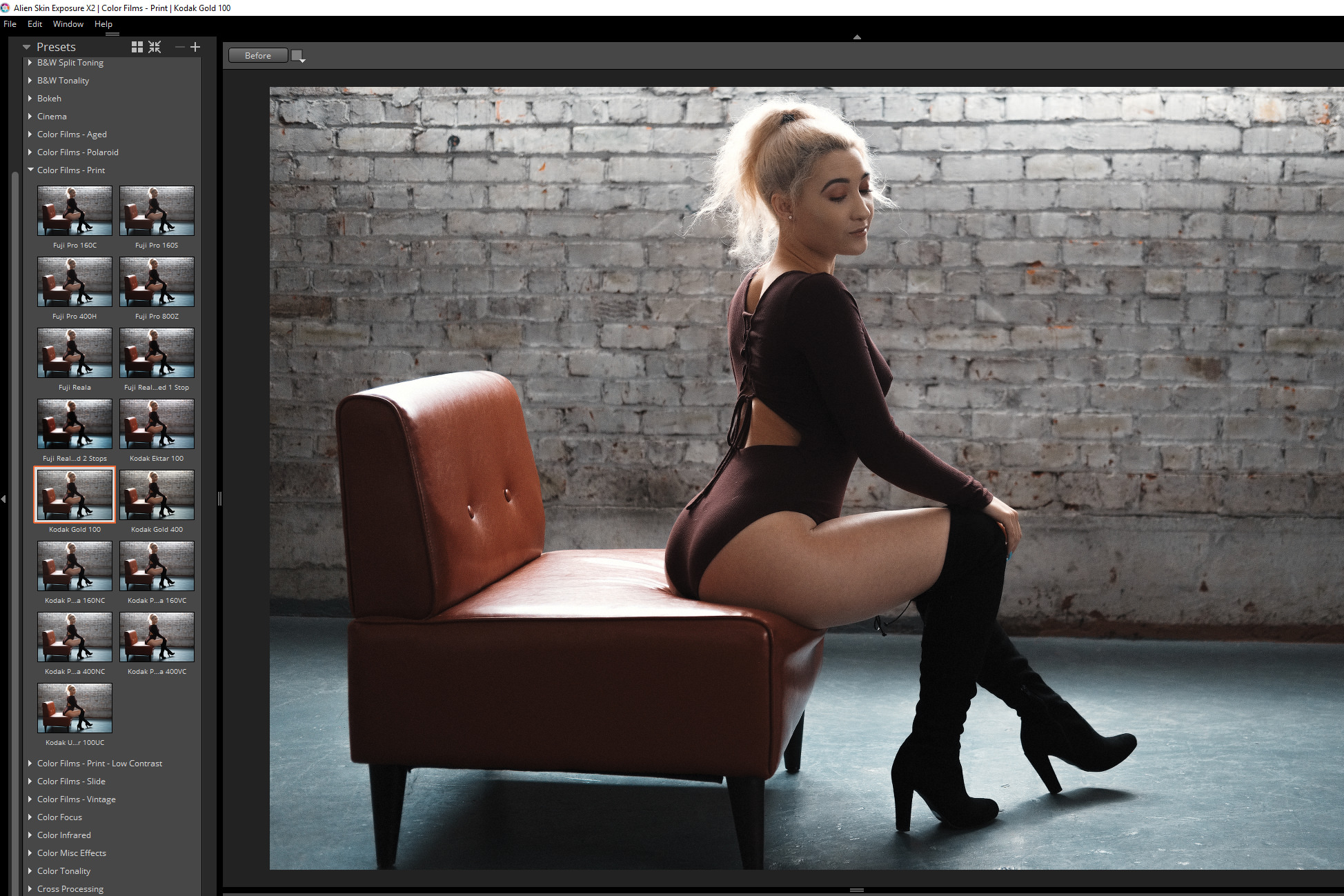
In ASE X2 I apply the Kodak Gold 100 film preset, and then I set the overall intensity to 75%. Then I change the grain pattern to 120film, and I set my sharpening to 15. Then send the image back to Lightroom.
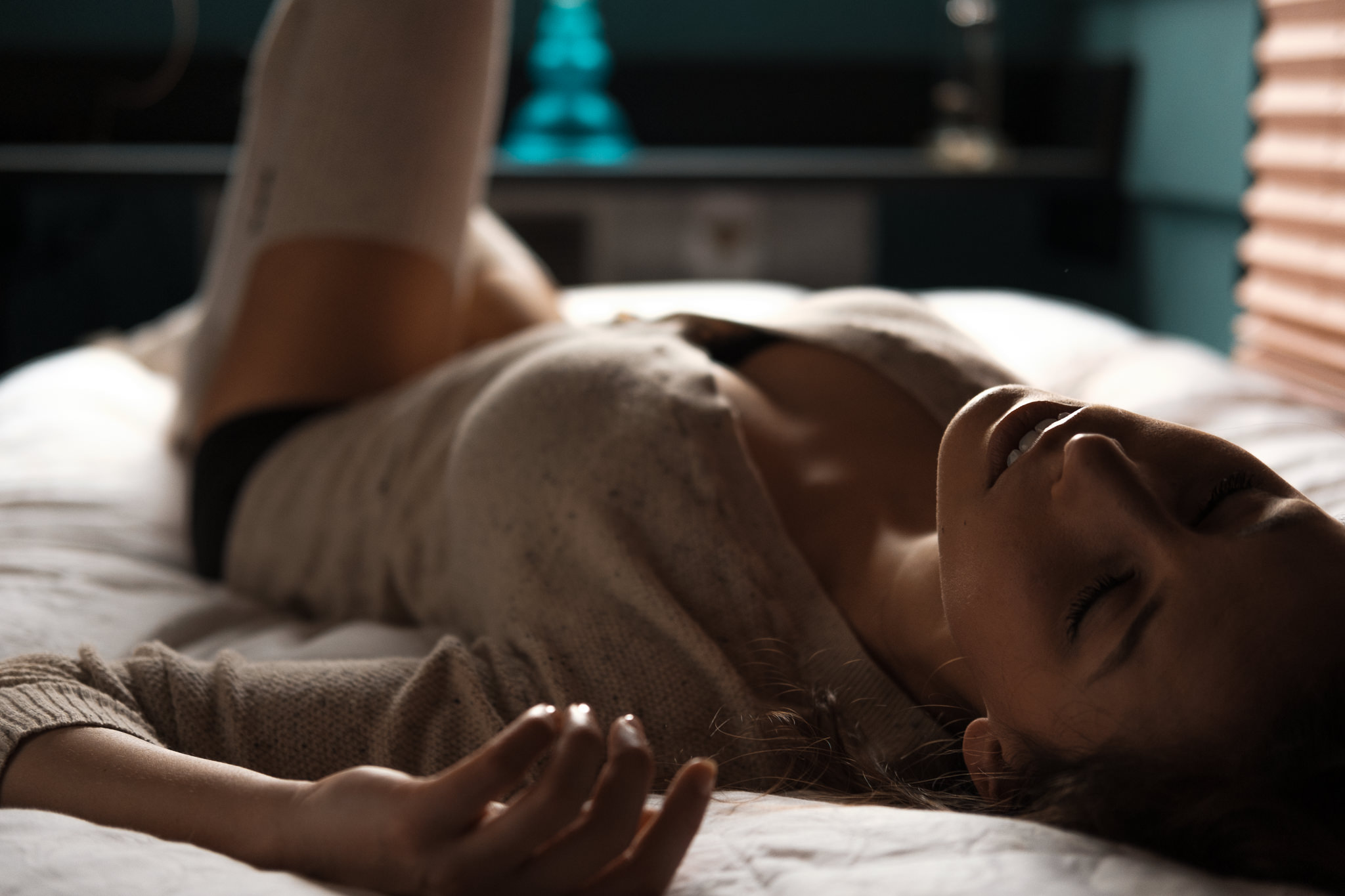
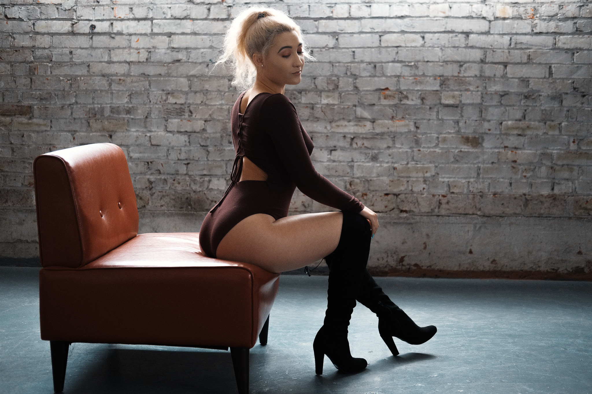
Here is the finished image. It’s not too crazy, but she has good tone and the image doesn’t look overprocessed either. I love this look and have been enjoying going back to some of my old black and white work and seeing what I can do with it using this new processing method I’ve been using.
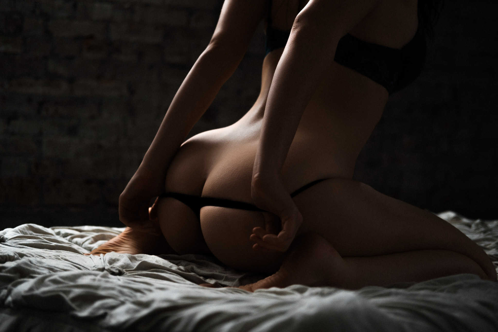
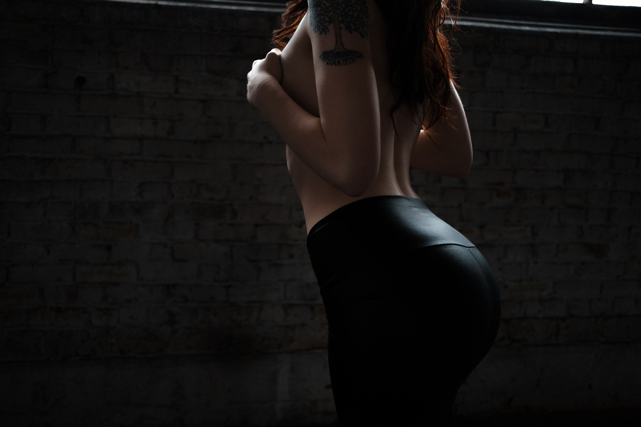
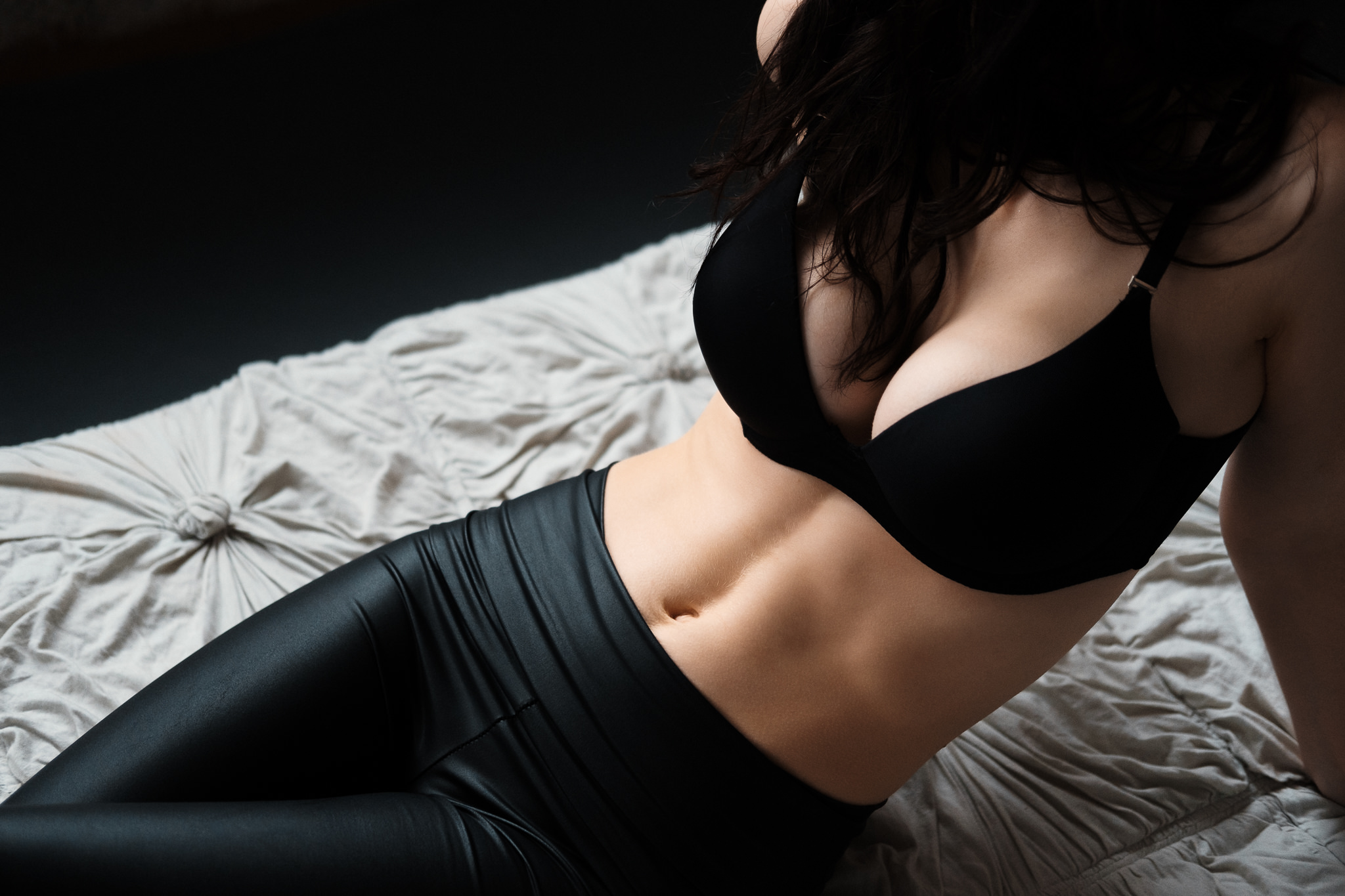
Hope this was helpful, or at the very least interesting to those of you looking for new processing methods to try out as you look to develop your style. Here is a quick look at some other images that I’ve used this process on with great effect…