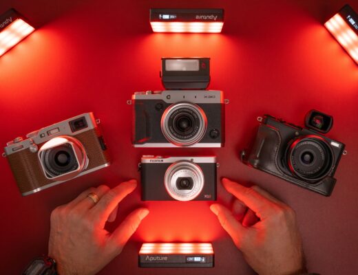
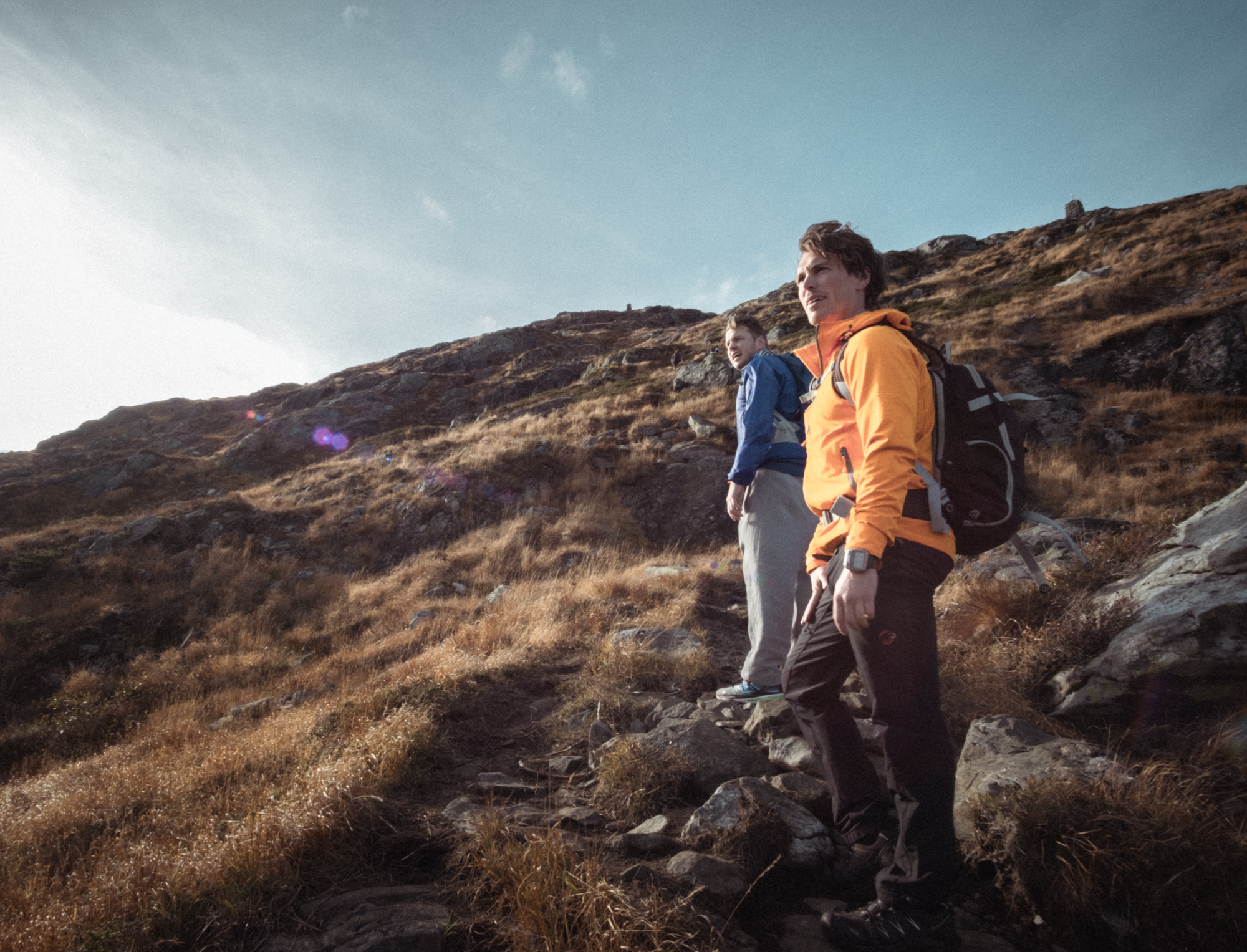
Being relatively new to photography, I quickly learned that the best way of improving is to simply bring the camera with me and take pictures. Thousands of pictures. I`ve experimented with black & white photography, vintage lenses, HDR, long exposures, timelapses and so forth. I`ve learned a few new tricks, and I intend to keep exploring just for the fun of it.
At the same time, it would be great to be able to achieve a somewhat consistent look to my photography. Given my current lack of focus on specific genres, I believe that the summit of this journey will, to some extent, forever be beyond reach. But having some guidelines has helped me get slightly closer to consistency, and I`ll share them with you in this article.

It might be helpful to occasionally remember who you are actually taking pictures for. Instead of making Instagram likes my benchmark, I made a decision to try to create a look that I, myself, find visually pleasing. After all, it is my living room wall some shots may end up on. And even if the goal is to achieve a sizeable following on social media, I believe that having a consistent look to your images is the way to go.
This led me me to an important question: what kind of images evoke feelings in me? In order to answer this, I started to reading different photography blogs and doing research. Time went by, and still the question remained unanswered. So I started cataloging, in other words making a collection of inspiring images I came across. If you for example use Pinterest as a source of inspiration, I’m sure you are already doing this in form of a “board”. I, however, tend to come across these images on different platforms and devices, which has led me to use Google Keep for this purpose. Here you can easily create different tags to systemize the content as you see fit. Google Keep also has the benefit of allowing you to save links or texts, but you may of course find that other platforms are more suitable to your needs.
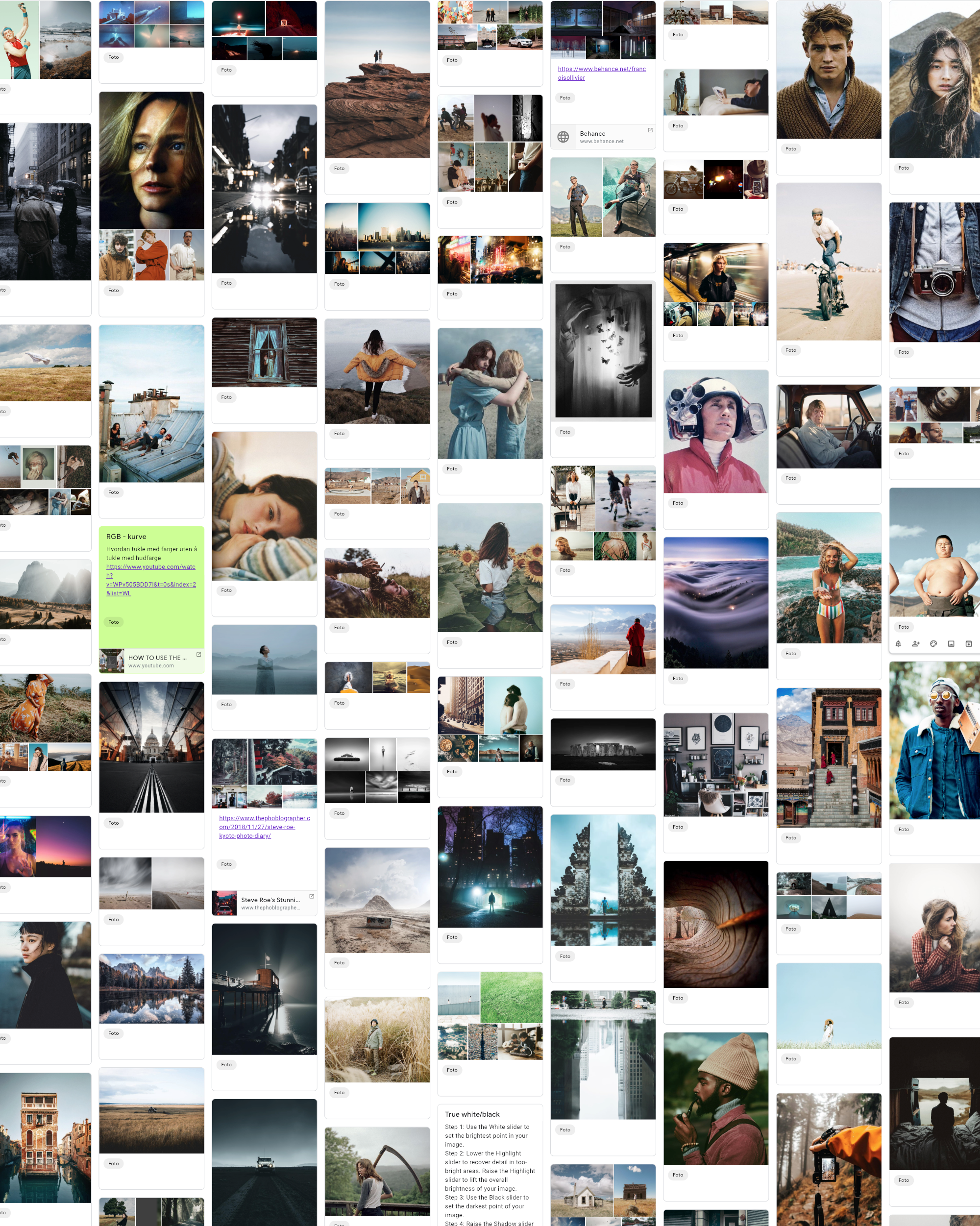
These are just the latest entries to my collection, which has gotten quite extensive over the last few months. And here comes the important part: by looking at the collection from some distance, I’m able to spot some common features among most of the different images. Discovering these common features has helped me realize what photographic qualities I personally like.
Here’s a few of my findings:
Sharpness is not important to me, and I even find many film photographs to be plenty sharp. Keeping in mind that the Fuji lenses are some of the sharpest available, I`ve now set the sharpening amount in Lightroom to 0. I even tend to decrease the clarity to get a slightly softer image.
Also, quite a few of the images in the collection have a certain filmic look, with some of them being actual analog photographs. You might have noticed a picture of a young Paul Newman in the collection. I wish to encompass this feeling in my photography somehow. Experimenting with analog cameras has certainly crossed my mind, but I’ve put that endeavour on hold just for now. I did however look into legendary film stocks such as Kodachrome for inspiration, and learned that Kodak re-introduced Ektachrome only a few months ago. Even though I only shoot digital, I was happy to hear about this analog development (pun intended).
I believe that it is, at least to some extent, possible to recreate the filmic look by using my X-T2. Brendan Burton, a very talented photographer (look him up), manages to keep a consistent and recognizable look – even when switching between his digital and analog cameras. Sure, there will be differences, but they are surprisingly subtle (at least to my eyes) when looking at his portfolio.
Building on this, I started tweaking the tone curve and HSL panel, in order to create a palette reminiscent of the old film stocks. The use of Fuji`s Classic Chrome colour profile in Lightroom is a given, but I was surprised to learn how far the in-camera-settings will take you. In fact, I only post process about 20% of my images, the rest goes straight from camera to the cloud. On some rare occasions I´ve even found the JPEG`s colours and grain to be better than my edited RAW`s, so I ended up doing only minor adjustments on the JPEG itself.
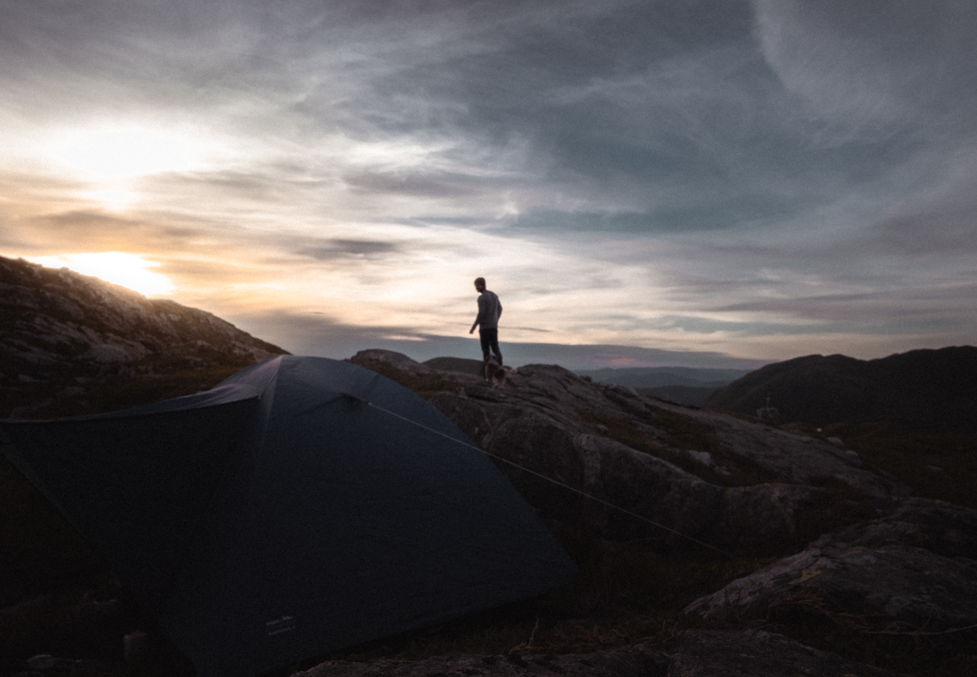
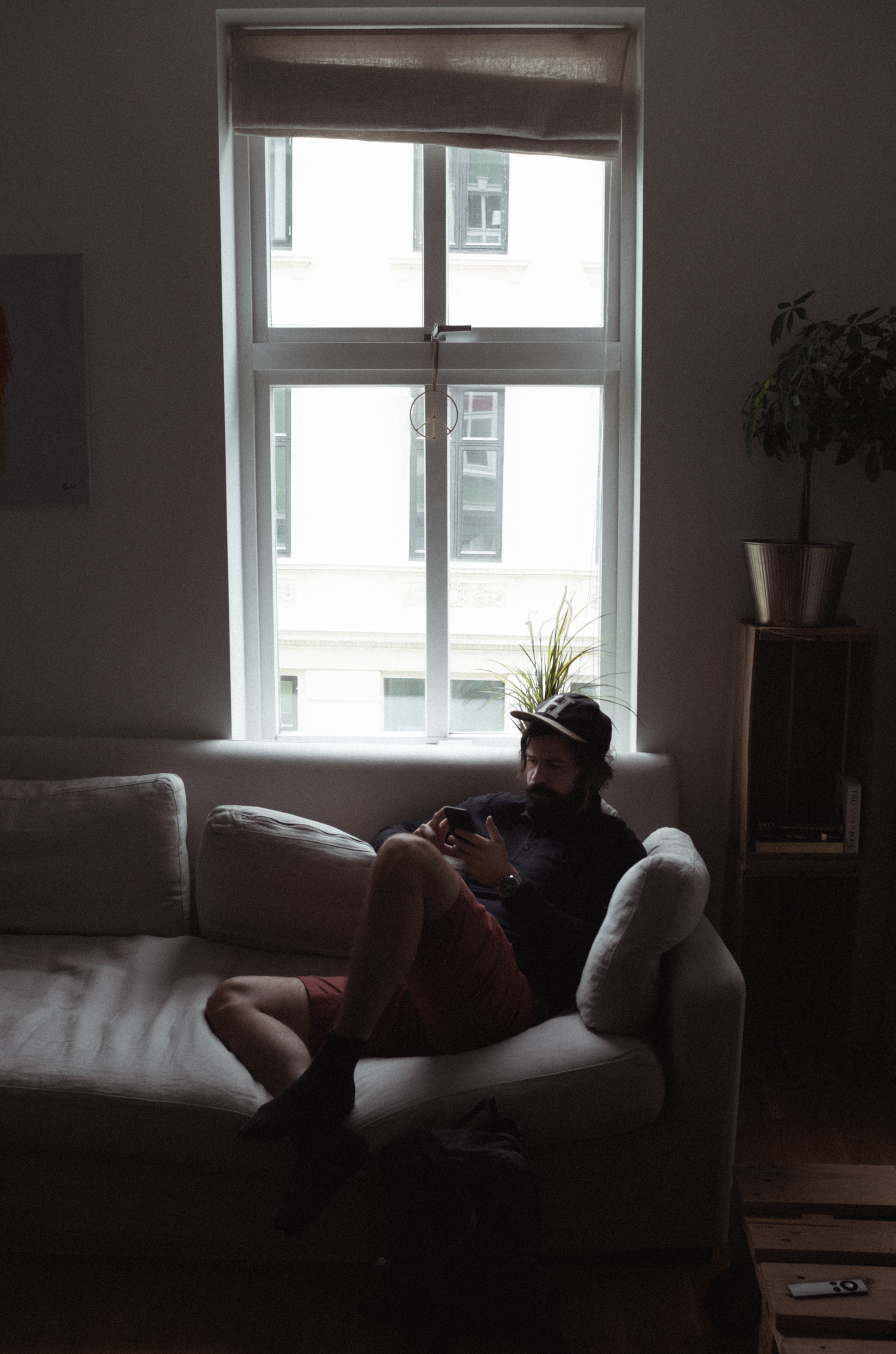
The term “good light” warrants an article in itself, but in my case I find that it is easier to achieve the right colour tones on bright, ideally sunny days. If I`m indoor, I appreciate having the subject close to the lightsource. I then expose for the brightest parts of my subject using the exposure compensation dial, as I`ve done in the living room shot you saw above. By adjusting the tone curve and the HSL panel in post, I get close to the look I`m going for.
I intend to keep bringing the X-T2 along as often as I can, and to find a good balance between consistency and exploration. That way, my photography will hopefully continue to evolve, but now with a vision in mind. Thanks for reading, and let me know what you think!