
As digital photographers we are able to capture the colors of the world and share them with the whole world very easily. When developing the RAW pictures from original to a final processed version, we are often editing a lot to get the look right. Exposure, white balance, tone curves and sharpness are adjusted as we like it. Different styles are established and personal interpretation is separating the good from the common photographers.
But if investing so much effort and time in editing, it would be annoying to end up with wrong colors. Like sharp and precise tools for a carpenter, the monitor as our “shaping” tool has to be precise, too. On the one hand this will ensure to transfer your subjective interpretation of color grading in the same way it was intended to. On the other hand it enables you to guarantee a color-true workflow where it is needed (e.g. product pictures of clothes, food, etc.).
In this article I will share some knowledge why you should get your colors right and how you can calibrate your monitor display to fit your needs. This will be a brief overview and illustrates just a small part of a very complex topic.
Basic Knowledge – A Brief Overview
Color in general is a perception of our eyes (and brain) caused by electromagnetic waves which are reflected from material. Our eyes can “register” waves with a wavelength from 380nm (blue) till 780nm (red) and our brain processes these neural stimuli to a certain color. But colors can also be produced by emitting sources. These days the most known self-emitting source is probably a display (laptops, smartphones, etc.).
A display by itself can emit only 3 colors: red, green and blue (RGB). To produce other colors these 3 are mixed together – which is called the “additive color mixing”. “White” is produced by adding red, blue and green together. If something seems to be black, no light is emitted and therefore you just recognize the black surface of your monitor. This fact is automatically limiting the amount of colors which can be shown by your monitor display (e.g. the built-in red lightsource will be the brightest “red” your monitor can produce).
Trying to compare the colors which can be produced by different sources leads to the so called “color spaces”. The largest color space is given by the nature and is called Lab color space: it contains all perceivable colors and serves as reference. For a better understanding all color spaces are flattened down from a 3-dimensional space to a 2-dimensional pallete. As an example, the graphic shows a comparison of the Lab (square), AdobeRGB (black line) and sRGB (white) color space.
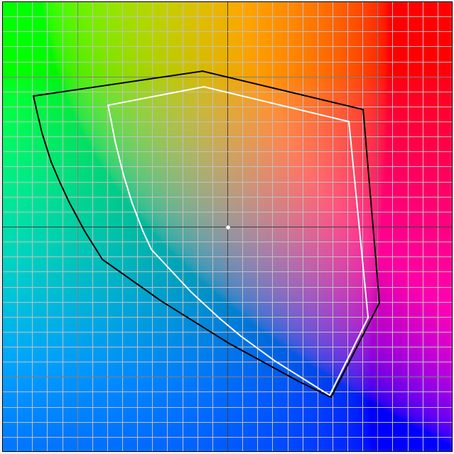
You can recognize a much smaller color pallete which can be displayed by RGB screens compared to all available natural colors. Such as your monitor cannot show you all available colors, your camera can not record all available colors on its RGB sensor, too. But we are in a bit of luck: Our Fujifilm cameras are able to record in AdobeRGB color space (jpegs).
Everybody knows: the real world is the most beautiful thing in the world and we can only try to capture it but will never be able to reproduce it. However, we want to be able to see all the colors we recorded with our camera in the right way. Therefore we have to display them right.
Where Is The Problem?
There are two main problems: monitors’ color space and calibration.
Monitors
Consumer (usual) monitor displays are not produced for high color accuracy and therefore they cannot display the same color space your camera is recording (talking about Fujifilm X cameras). So if your monitor is able to show just 85% of sRGB you will “lose” 15% of the colors your camera recorded in sRGB mode: your image will look flat and dull.
Considering a monitor which is able to display 100% of sRGB color space, everything is fine for digital publishing. You will see what you got (recorded).
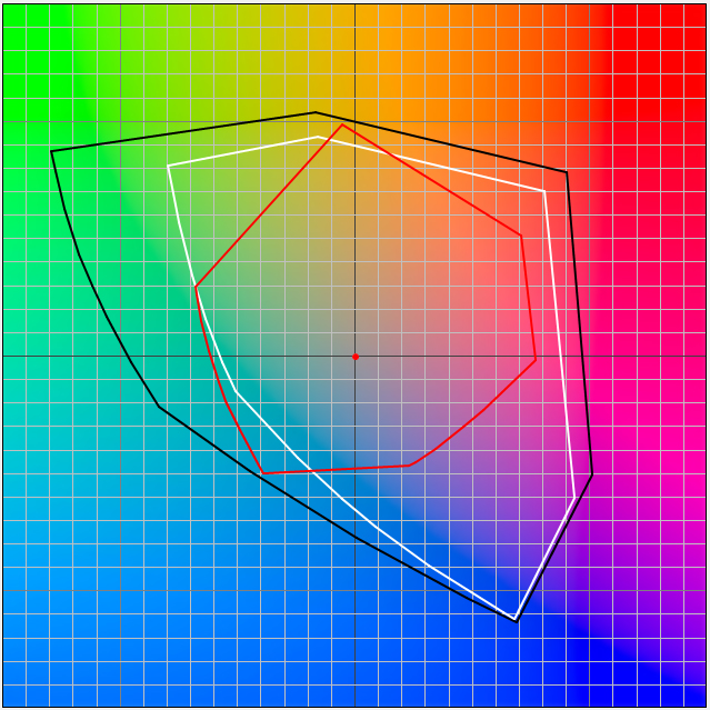
But if you want to print your pictures, you will be faced with another color space, resulting from the subtractive printing colors (CMYK) and the non-emitting material (e.g. paper). This color space is described by ISO scales and their size vary due to the paper color and paper surface. As an example you can see the ISOcoated_v2_ECI space for coated white paper (red line) in the graphic. Compared to sRGB color space (white line), the printing color space is wider and a printed image can contain more colors than a sRGB monitor can display.
Some printable colors cannot be displayed within the sRGB color space and therefore professional displays have a wider color range and cover the AdobeRGB or even wider color spaces (so called wide gamut monitors). These monitors are essential for proofing colors in digital prepress. Well known manufacturers are Eizo and NEC. They offer monitors for professional photography, design and prepress which often can display 99% of AdobeRGB.
Calibration
The ability to display a wide color space does not mean that the colors are shown correctly. Due to display technology, production variation, operating temperature and many more the color rendering of a monitor can shift. This can be compared to a scale which needs to be tared to weigh correctly. This taring process can be achieved by color correction and monitor calibration.
Examples
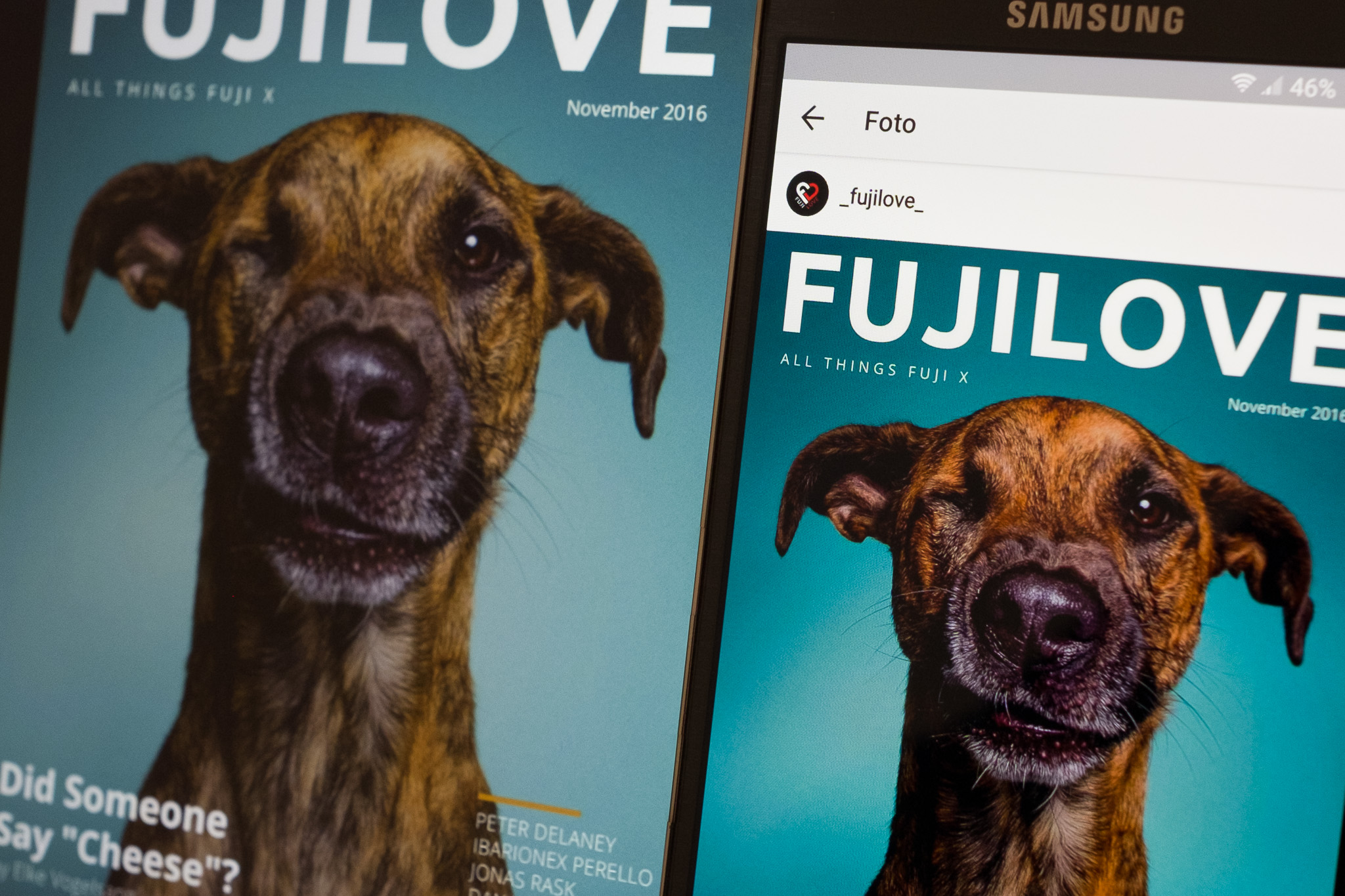
Take a look on the image of the FujiLove cover and you will easily see the difference in color of the two different screens (laptop left side, smartphone right side). The Samsung AMOLED display seems to be more saturated, whereas the laptop screen seems to show a yellowish tint. This picture also shows the former mentioned problem. Which screen shows true colors? Will a printed version of the magazine look totally different?
Let’s have another look what can happen editing with a non-calibrated monitor. The following example is a real life example of a product-shooting for a clothing label I did one weeks ago for their online-shop. The picture shows a male model with a red shirt (0). When importing the RAF file into your raw converter you get an unprocessed, flat version (1) and have to bring the colors as close to the original shirt as possible. Thereby your screen serves you as a controlling instrument. Assuming your monitor is shifted to a cooler tone, you see the image like the right side of the second picture (2). Now you try to counteract and rise the yellow tones (complementary to blue) of the image to match the original shirt which lies in front of your monitor. Successfully done, the picture on your screen looks like the shirt in front of you. Exporting and uploading to the online store is also done quickly.
But if a customer looks at the picture on his calibrated screen, he will notice a very yellow-colored (warm) picture and the former red shirt (0) seems to be closer to an orange one (3). Maybe he will not buy this shirt because of this special color, or he will return it, after recognizing he has bought a red one with an orange one in mind.


AdobeRGB vs. RGB
The most common color spaces are rooted in different standards of huge companies such as Microsoft, Hewlett-Packard or Adobe and are created by definition of the amount of colors. sRGB was formerly developed for the good old CRT-monitors in 1996 and became the industry standard very fast. It is smaller than CMYK (used in printing) and therefore has been criticized by the printing industry. Adobe established their own RGB color space in 1998 and implemented it in their software since then. It encompasses around 50% of the visible colors and can display all printable colors (CMYK).
Our Fujifilm cameras can shoot in sRGB as well as AdobeRGB. You can change this in the main menu -> second blue tab -> color space. This will only affect the jpegs which are processed in camera and you will use SOOC. RAF (raw) files have no color space and contain all colors which can be registered by the sensor. The color space will be added at the jpeg-export in your raw converter. Logically you would now like to say: In the future I will only work with AdobeRGB-jpegs, because the color space is much greater! But be aware: Some consumer programs like Chrome, IE, Word, etc. cannot handle the AdobeRGB and have to downsample the colors into sRGB color space. Stepped color gradients can be a consequence.
Therefore you have to differentiate: If you don’t know where your images are be viewed, you should choose the sRGB color space for Jpegs. If you are in control of the entire work- and dataflow from camera to printed product, you should choose a lossless format and add the color space for images appropriate to your end-product.
Calibrating Your Monitor
The calibration process nowadays is not complicated or tricky anymore. You will have to get a calibration tool with a calibration software. Two renowned manufacturer are “X-Rite” and “Datacolor”. If you go with their top products you will get powerful tools and be able to calibrate your monitor easily. Some professional “EIZO” and “NEC” monitors have built-in calibration tools and software and are calibrating themselves with a push of a button.
Here I want to show exemplarily the manual calibration with a “Quato DTP94”-tool and the “iColor Display”-software. The calibration is always done in 4 steps. Select these options and select the monitor you want to calibrate. In this case it is a wide gamut S-IPS flat screen. There you can also choose the Apple CinemaDisplay and other types of wide gamut panels.
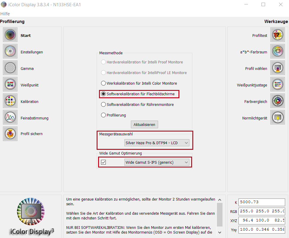
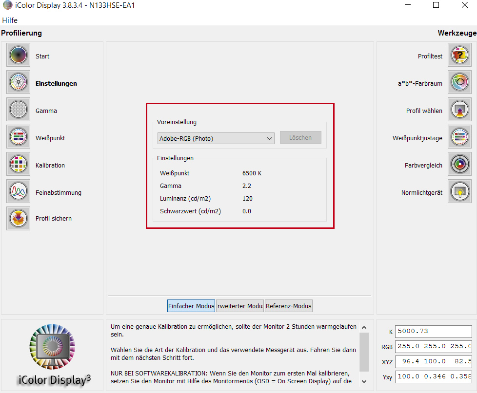
At first you have to define your color space. This defines all parameters which can be adopted and are affecting the color rendering: white point (in Kelvin), gamma and luminance (cd/m²). There are reference values recommended for different color spaces. The following table gives you an overview of these.
- sRGB: 6,500 Kelvin, 2.0-2.2 gamma, 120-140 cd/m² (online)
- AdobeRGB: 6,500 Kelvin, 2.2 gamma, 120 cd/m² (online/print)
- ISO_Coated_v2 and coatedFogra39: 5,800 Kelvin, 2.2 gamma, 120 cd/m² (print/prepress)
- PSO(un)coated_v3: 5,000 Kelvin, 2.2 gamma, 120 cd/m² (print/prepress)
This is meant for normal lit workspaces. If your monitor is surrounded by a lot of light sources, you should calibrate it with a brighter screen (140 cd/m²). If working in a dark surrounding, calibrate it with a darker screen (100-110 cd/m²).
Then the actual color rendering of the monitor is determined. The software gives you some advice how to change the color using the monitor’s hardware calibration (on screen display and hardware buttons). This is the most precise method. It can be compared to a scale, which does not weigh correctly: Changing the construction gauges the scale. You have to place your calibration tool onto your monitor to cover the color-window of the software.


The software measures the hardware-calibrated color rendering and creates a profile which adopts a value to all the “wrong” colors to fit the colors as they are meant to be. This profile can be saved and applied to your monitor in the OS.
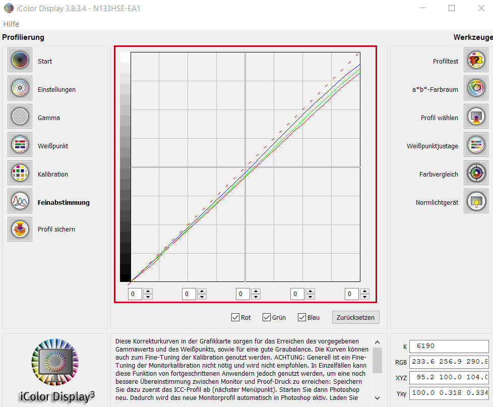
iMac users are not able to change the monitor’s color rendering by hardware buttons and have to rely on the software to calibrate it. Similarily most of laptop users are forced to do so. So you have to bring the red, green, and blue line as close to a 45 degree diagonal (doted line) as you can.
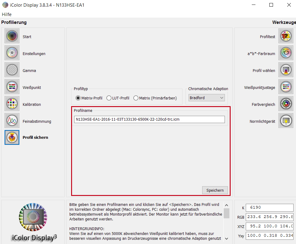
At the end a profile is generated and you can save it to your system. Don’t forget to activate it in the system administration for the monitor you are using.
Now you are done and have finally a calibrated monitor. This helps you to see the colors on your display as they are recorded and saved in your image files.