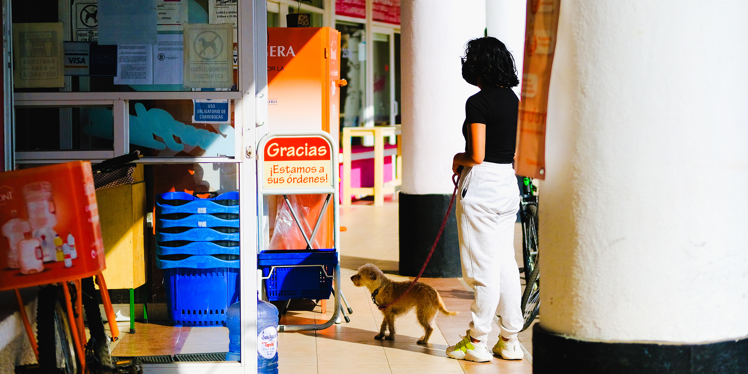
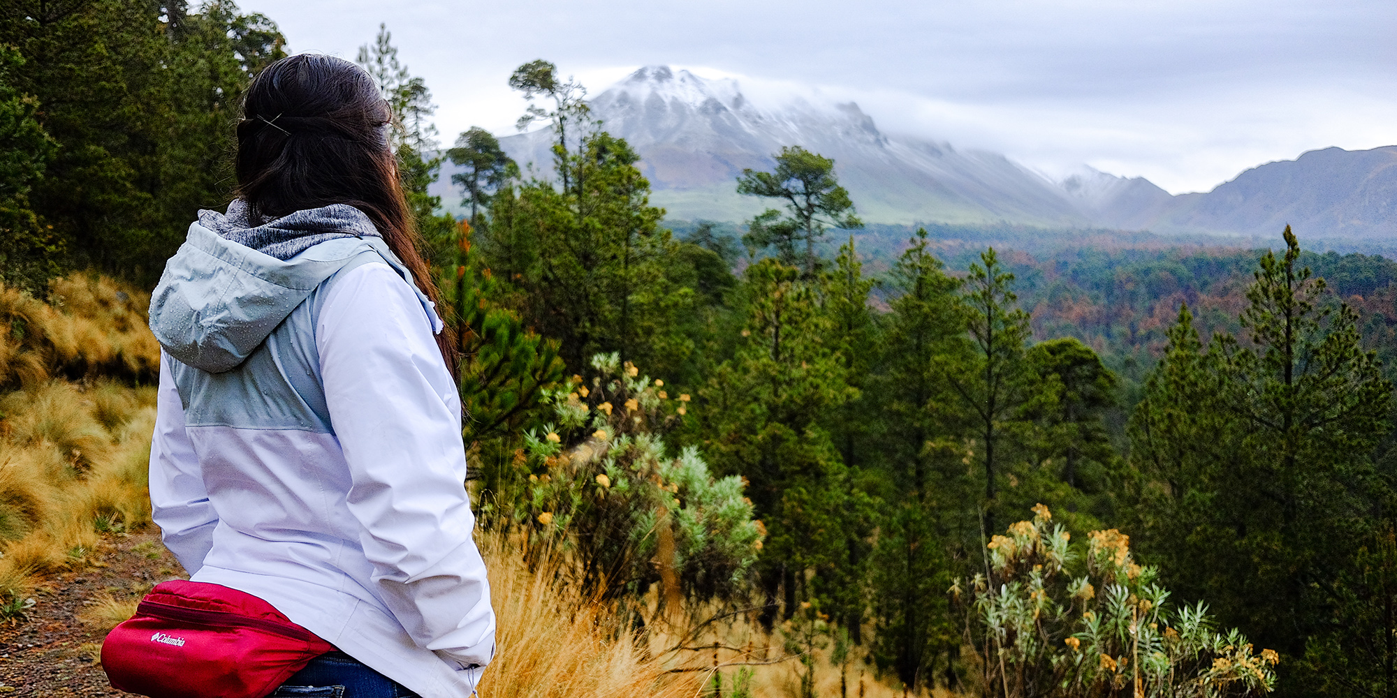
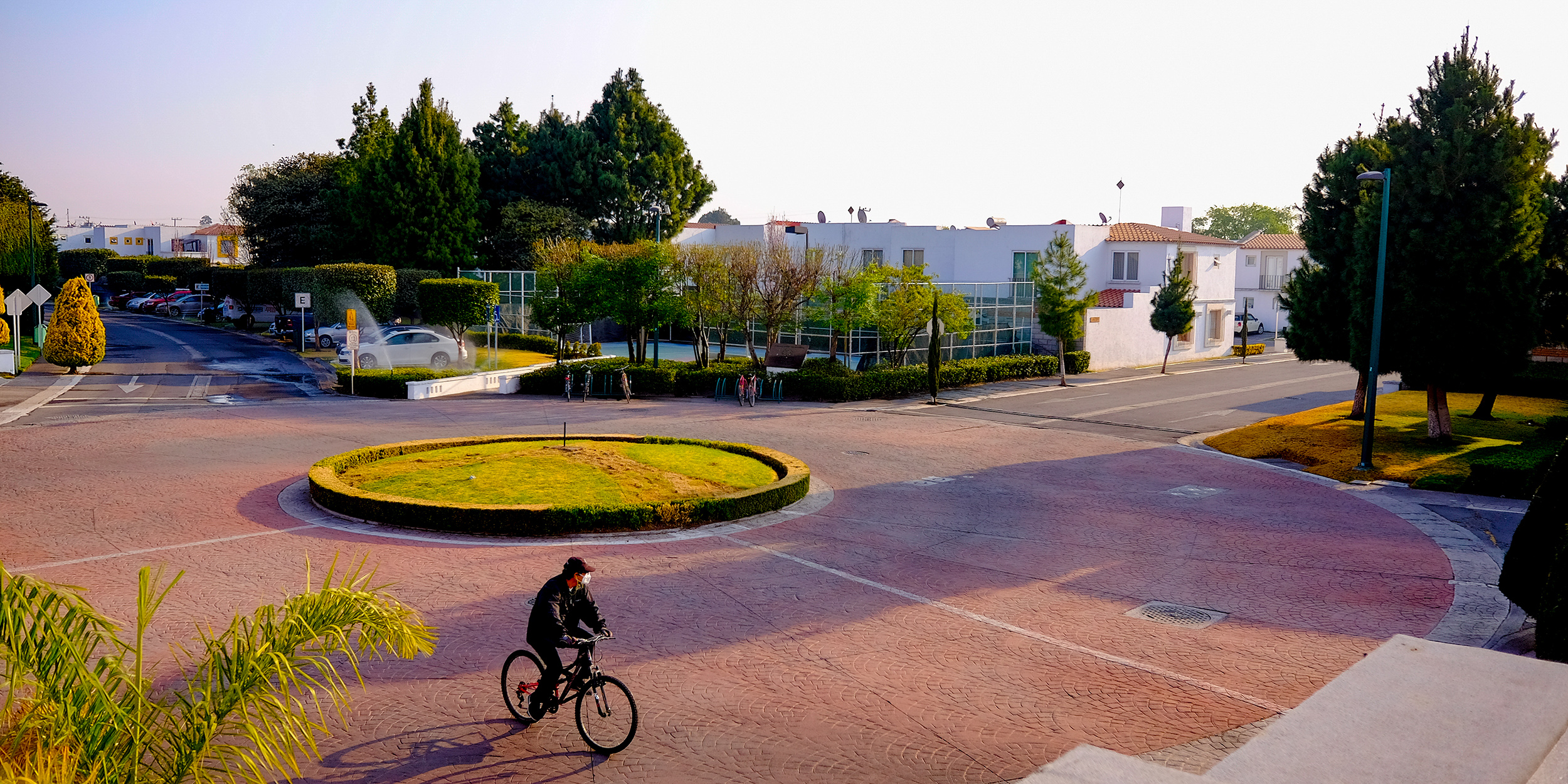
I struggle to shoot colour. I don’t mean changing the camera out of monochrome mode, I mean pre-visualising colour and composing for colour. Sure, I know a cute sunset when I see it, but I don’t have the intuitive awareness to bring colour composition into my snaps and street photography with the kind of speed a fleeting moment might require. What other choice do I have but to evolve my perspective?
So far, the learning curve to retrain my eye feels steeply unpleasant. It’s a strange and punishing thing to overcome. My first taste of the struggle arrived way back when I switched from the Sony A7II over to the X-T2 for the image quality. Back then, I was tinkering deep inside the picture profile menu jargon to achieve the holy grail: Portra-like colours in-camera. You know the type, low contrast, green-shifted for cyan skies, cloudy white balance for any occasion. Similar to how the world appears through fancy sunglasses. Everything was easy back then. I never thought about colour at all.
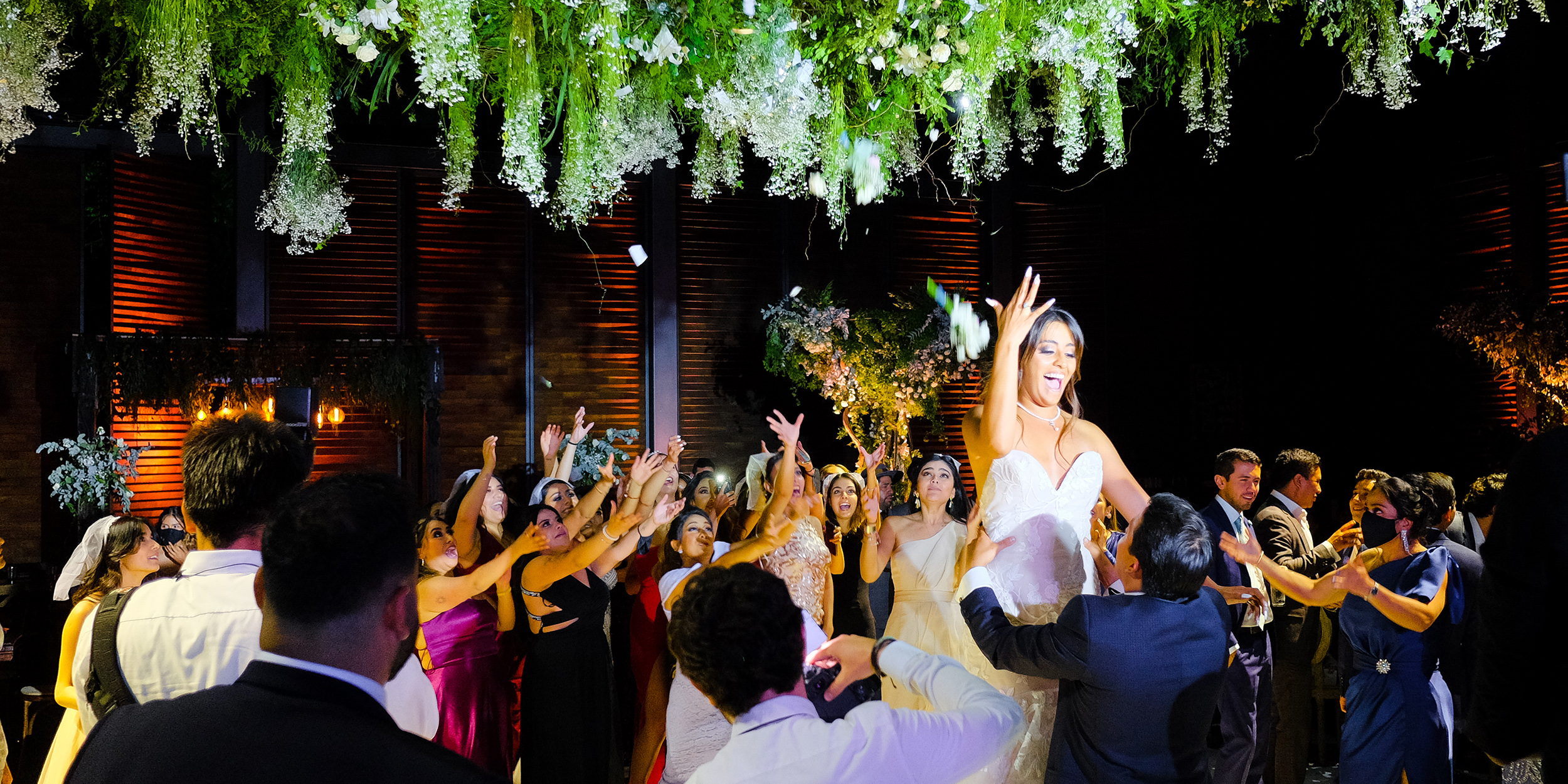
To tell the truth, I wasn’t even thinking about light. I was all about composing subjects. I have a good couple years of underexposed, warm-teal portraits of gas stations, motel signs, basketball hoops, and cherry blossoms. All mid tones, with the black point lifted to a trendy milky fade. It was great! Everything looked like a hazy Kodak memory, and the overly bronzed white balance really helped to reign in the lobster-like hues of my coral-pink face. Double bonus. Honestly, I’d probably still be there if I hadn’t switched to Fujifilm and hated it.
I was shooting Skittles. Everyone said I could set it to auto white balance and get beautiful colours, so why was every photo looking like it had been shot through a rainbow? It was so infuriating. I couldn’t for the life of me take a photo I didn’t hate, but the vengefully stubborn little child I am persevered and overcame the problem — I switched to monochrome. Besides, black and white always looks meaningful, even if it’s just a portrait of a lost sock on the sidewalk at f1.2.
I had heard some great advice: Shoot monochrome raw, to help compose for light, and then change it to colour later.That’s a great learning tool. It really helps with training the eye to become aware of light, and to turn it from an intentional action to an instinctive one. However, it didn’t really solve my problem. My colour photos were just monochrome photos with the saturation turned up a little.
I stayed with Classic Chrome and Pro Neg a while, stuck on AdobeRGB, and desaturated as much as possible because I was afraid to shoot Fruit Loops again. I was frustrated. I couldn’t go back to muddy green, because now I was thinking about colour, but my colour photos were overwhelmingly distracting, despite all of my best HSL editing efforts. Sure, I could pull my warm hues into a nice consolidated golden middle, and my cool hues towards an ocean tealy blue, but this was supposed to be the straight-out-of-camera brand! I wanted those Fujifilm colours I had heard so much about. Then I found the answer.
Astia — Hear me out, it’s not exactly about Astia. Astia was just the first step. I tried the more colourful profiles, still in AdobeRGB, but I tried them. I skipped over Provia entirely because of the whole lobster situation and went with Astia. Its subtle orange-blue split toning weaned me away from my overreliance on using warmed up white balances to muddy those hard to compose colours, but it also kept the contrasting blues vibrant. It sounds ridiculous, but I felt suddenly aware of how blue the sky was in real life.

Astia was my new learning tool to help create awareness of colour, and then move that awareness from an intentional action to an instinctive one. It did this by making me realise that the problem wasn’t the colours, it was my composition. I was pre-visualising nice light, but not considering the colour in the frame. I almost had to flip my thinking. I had to focus on looking for nice colour harmonies, and then force myself to shoot them, even if the light was less than stellar — A kind of visual note to keep me progressing. So, I switched back to SRGB colours and went to +2 Colour.
Like monochrome did for light, Astia was vibrant enough to punish me for errant colours in frame in the moment of composition. It had me looking for vibrant distractions before lifting the EVF to my eye. I started to be able to predict the colours Astia was going to show me, just like I learned to predict what my focal length was going to show me. It was a huge change of perspective, as if my eyes had levelled up or something. I felt like I was seeing the world in Astia, and colour composition became less and less intentional. Then it got a little out of hand.
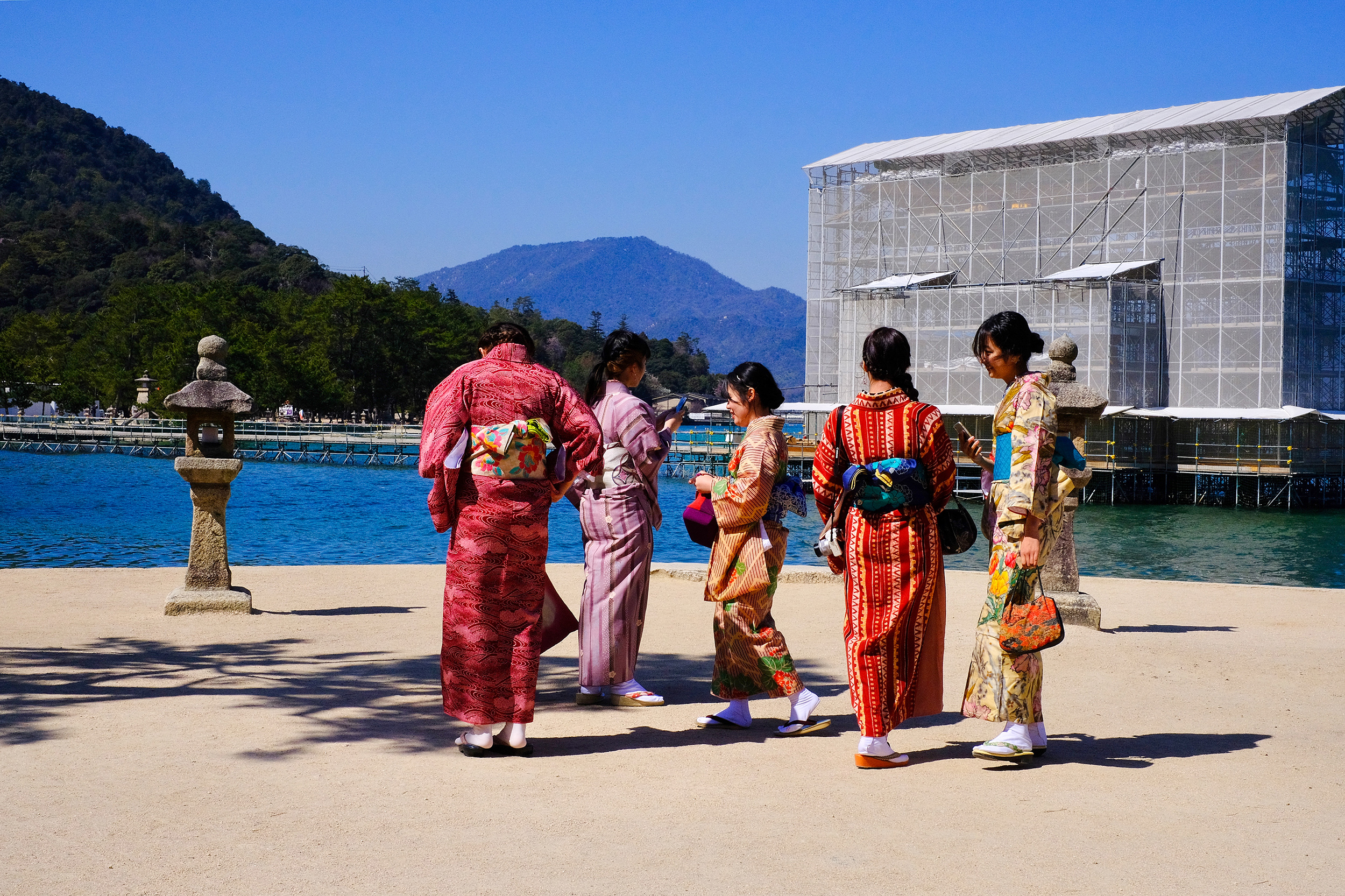
I don’t shoot much Astia anymore. I shoot mostly Velvia. I made the transition when I went to live in Japan for a year. I went back to AdobeRGB, but set it to +3 Colour. +3 Colour Velvia isn’t quite the hardest difficulty setting, but it does get punishing up there. A change of lens can throw off your whole look, colour, and rhythm, with its coating changing the contrast, or glass recipe changing the colour rendition and tint. I have toned it back down to a couple everyday Velvia profiles now, but it was a great learning experience to be so extreme, and I think in no small part; being in Japan helped.
I still have a way to go in terms of quality colour photography, but I’m enjoying it more now. I couldn’t tell you what the next level of compositional awareness is, I’d have to ask a more experienced photographer. Maybe it’s shooting for layers with a wide angle at a high aperture, maybe it’s buying a dynamic symmetry sticker for my X-70’s LCD screen and trying to get some tidy Baroque diagonals going, like how I use electrical tape for a 2:1 “T-X1” crop.
Either way, I appreciate the struggle and the tools which help us to focus on one learning curve at a time as we level up our perception in this visual medium. Be it Kodak-style warm-green recipes which help us to focus on our subject composition, or monochrome for light composition, or overly vibrant positive film simulations for colour composition. It’s really nice to be able to have an aesthetic style to shoot for in each new layer of composition that we add as we improve our instinctive awareness and train our eyes. However, what I’m most grateful for is how photography has revealed the beauty in the mundane and meaningless, which would otherwise go unnoticed to the untrained eye. In the end, maybe I’m not so jealous of the intuitive visual geniuses anymore — I enjoy the struggle.