In last month’s article I talked you about the comparison between my Fuji cameras and my medium format Pentax 645N with the Fuji PRO 400H film. I shared my thoughts with you, and showed how, with the proper post production, the X-T20 with the XF56mm f1.2 can deliver matching results. The article produced a lot of comments, emails, messages, etc., all asking to share the precise steps to get those results. So, here I am, as promised, sharing the whole process, and the filter itself. Let’s start!
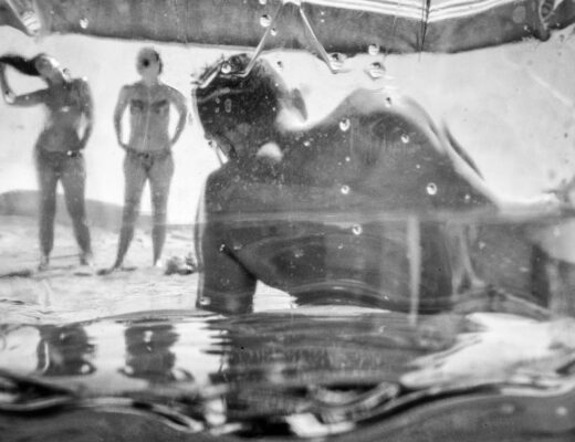
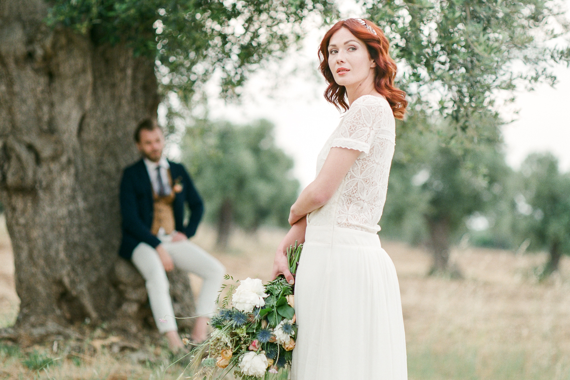
The two photos we are going to use in this article. On the left, as a Reference, we have the 400H film shot. On the right, as the Active, we have the X-T20 RAF file with no post production applied yet.
For the purpose of this article, we’ll use two photos, one film shot and one X-T20 shot. I took both at the same time, on the same spot, with almost the same composition, so they are an excellent pair to work on a matching post production. The film shot was taken on a Fuji 400H film with the Pentax 645N, mounting the Pentax 105 f2.4 for the 6×7, and a 6×7 to 645 ring adapter. The 105mm on a 645 body is almost equivalent to the 56mm on the X-T20 APS-C body, so I used the Fujinon XF56mm f/1.2 for the sake of comparison (and because it’s a great lens!). I use Adobe products, so the whole process will be done on Lightroom. I guess you can do that on other software too, but I don’t use any others!

Cropping is not necessary, but it will help us achieve the whole film look.
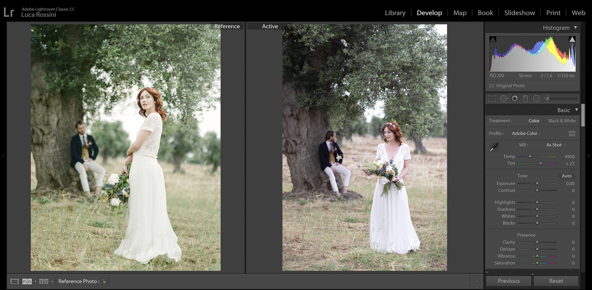
Medium format film does not have the same ratio of 35mm, nor of APS-C, 645 stands for 6×4.5 cm, with a ratio of 1.3, where the APS-C and the 35mm share a ratio of 1.5. In order to have the ratio of the two photos matching, we have to start with a crop. A dialog box will appear, saying Aspect Ratio: 1.00 x 1.00 – you have to change the short side of your pic in 0.77. This means, if it’s a landscape photo, you write 1×0.77, while if it’s a portrait photo you write 0.77×1. Now that the two photos match ratio, we can start with the postproduction.
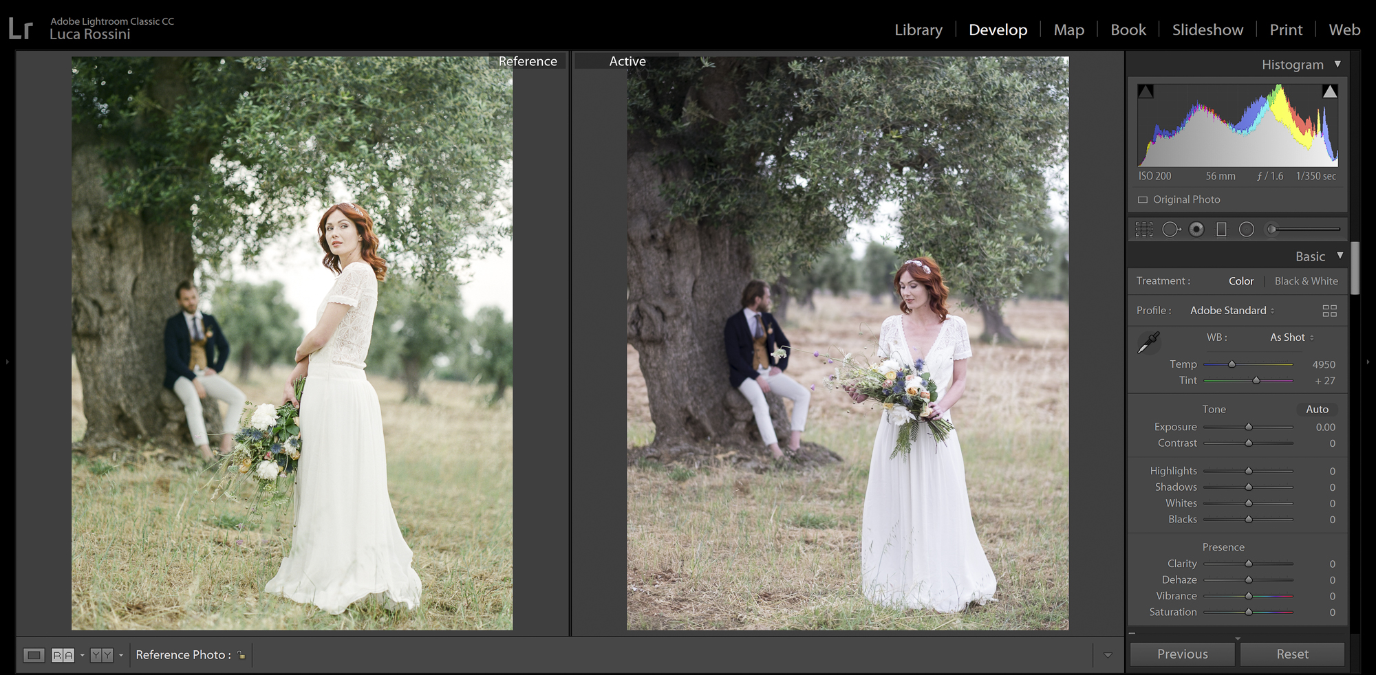
Setting the RAW Profile on Adobe Standard will give us a very flat image that works well with all the Lightroom tools.
In order to match the 400H film look, we need to shoot in RAW, because there’s simply no way to do all the postproduction we need to do on a JPEG. So, we’ll start the process by choosing a RAW Profile. The RAW profile determines how the very core of the raw is processed, and it is the most powerful tool in Lightroom, because it operates on a level that doesn’t impair the rest of the postproduction. You’ll find the RAW Profile at the very top of Lightroom Develop tools. I am a huge fan of Fujifilm’s own profiles (ASTIA, CLASSIC CHROME, PROVIA, VELVIA, etc.), but for as much as I love them, whenever I have to start on a completely new look, I tend to prefer the Adobe Standard. I find that this profile is very flat, but a little less dull than the Adobe Neutral Profile.
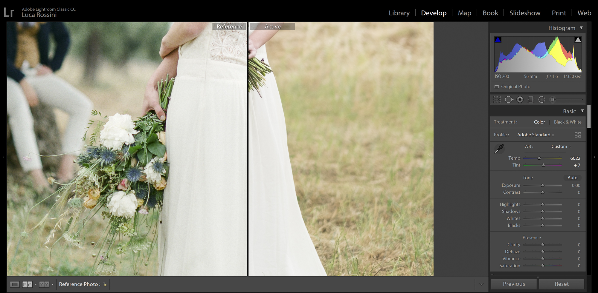
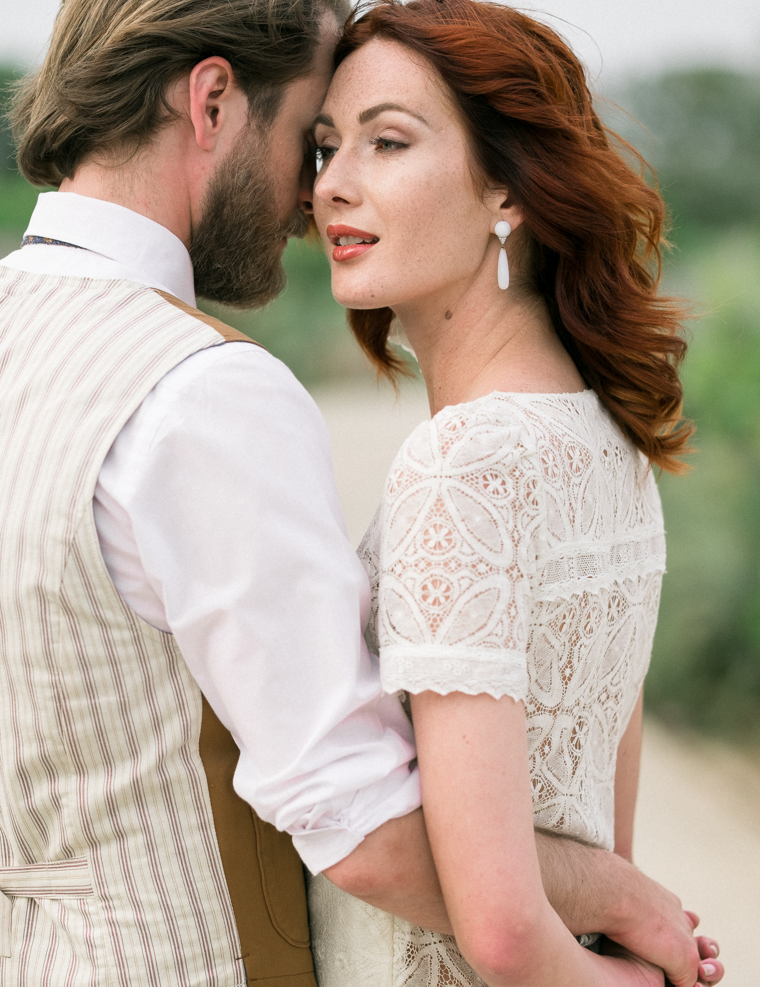
Focusing solely on the wedding dress is a great help when trying to get the white balance right.
Now it is time to work on the white balance. In the film age, white balance was “hardwired” to the each and every film, so “cloning” the white balance is one of the most important steps. In Lightroom you’ll need to set the White Balance on custom, and then work not only on how the white point shifts between yellow (the sun) and blue (the night), but you’ll also have to tweak the green/magenta ratio with the Tint. Using the wedding dress as the white reference, I worked on both sliders until getting the closest look.
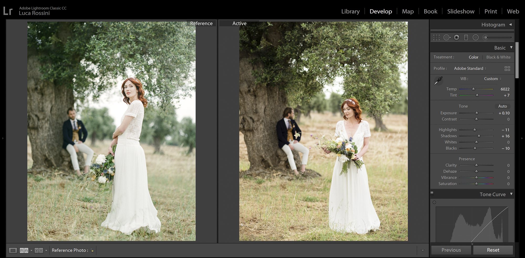
Matching the dynamic range of 400H with the Basic tool
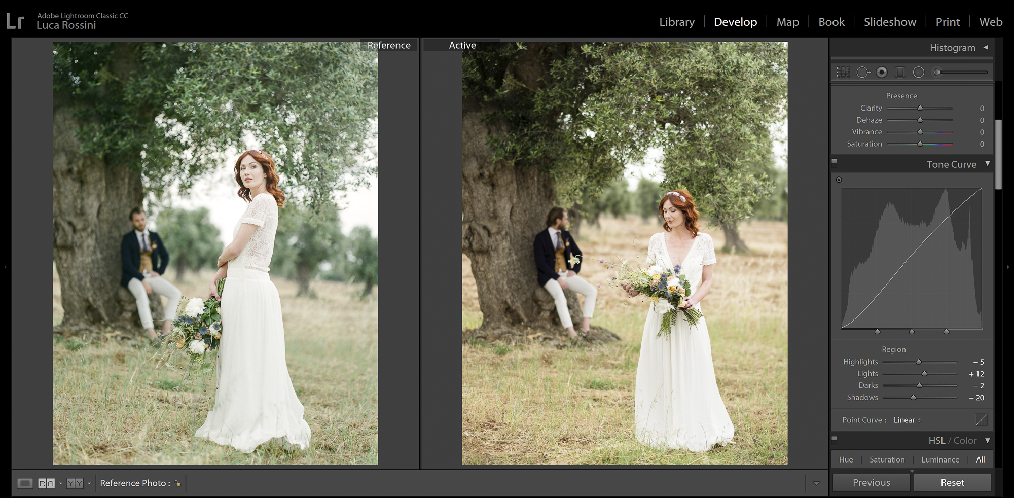
Matching the dynamic range of 400H with the Tone Curve
Another aspect that changes a lot between different films, is the dynamic range. The way highlights, midtones and shadows are rendered is a big chunk of the overall charisma of a film. Comparing the 400H and our unprocessed X-T20 RAW, we can see how the film has a little more details in the shadows, but the blacks are more black, so let’s open up the shadows and close the black with the Basic tool. The film looks also a little more exposed, so I’ll add a bit of that too. Finally a little tweaking with the Tone Curve tool recreates the proper dynamic range.
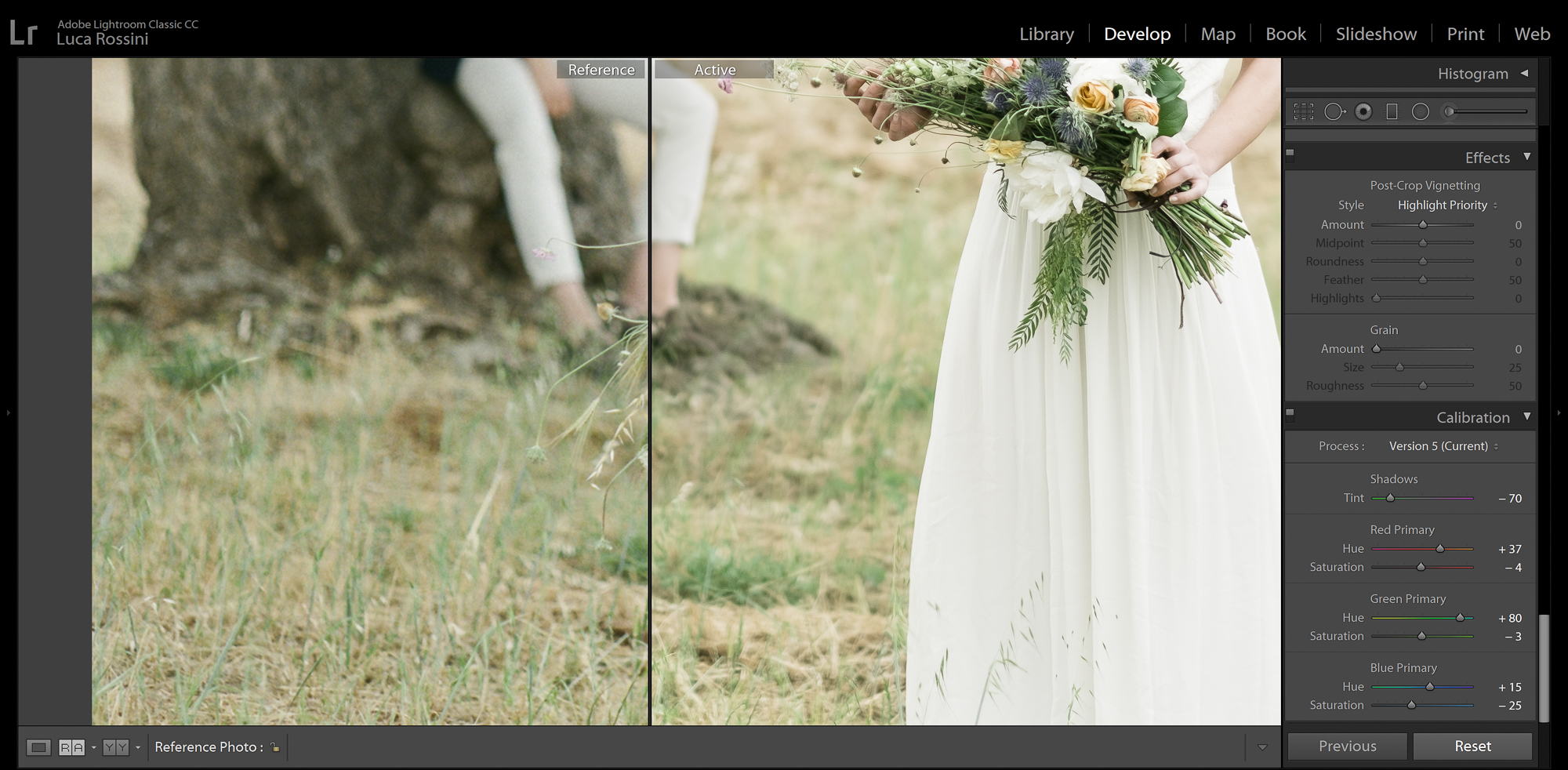
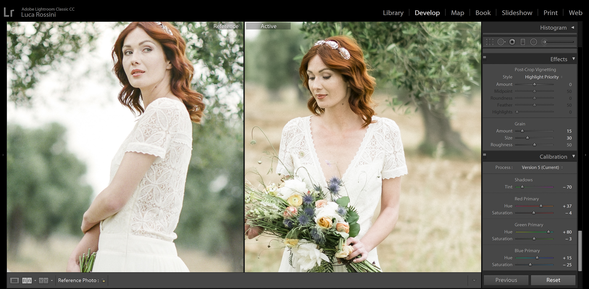
Matching colors with the Calibration tool
While the dynamic range and the white are now almost identical, the yellows and the greens in the field are way not. This means that we are still to mimic how the film renders the colors. Instead of using the, obvious, HSL/Color tool, we’ll work with a more powerful tool (the very last one on the develop list in Lightroom): Calibration. I tuned the tint in the shadows, and the hue and saturation of the primary red, green, and blue. I did work with all these sliders, and the results are now very close: look at the green of the leaves, at the yellow of the dry leaves, at the brown of the tree, and at the pink of the skin. There’s so much continuity that I could overlap the two photos almost without discrepancy.
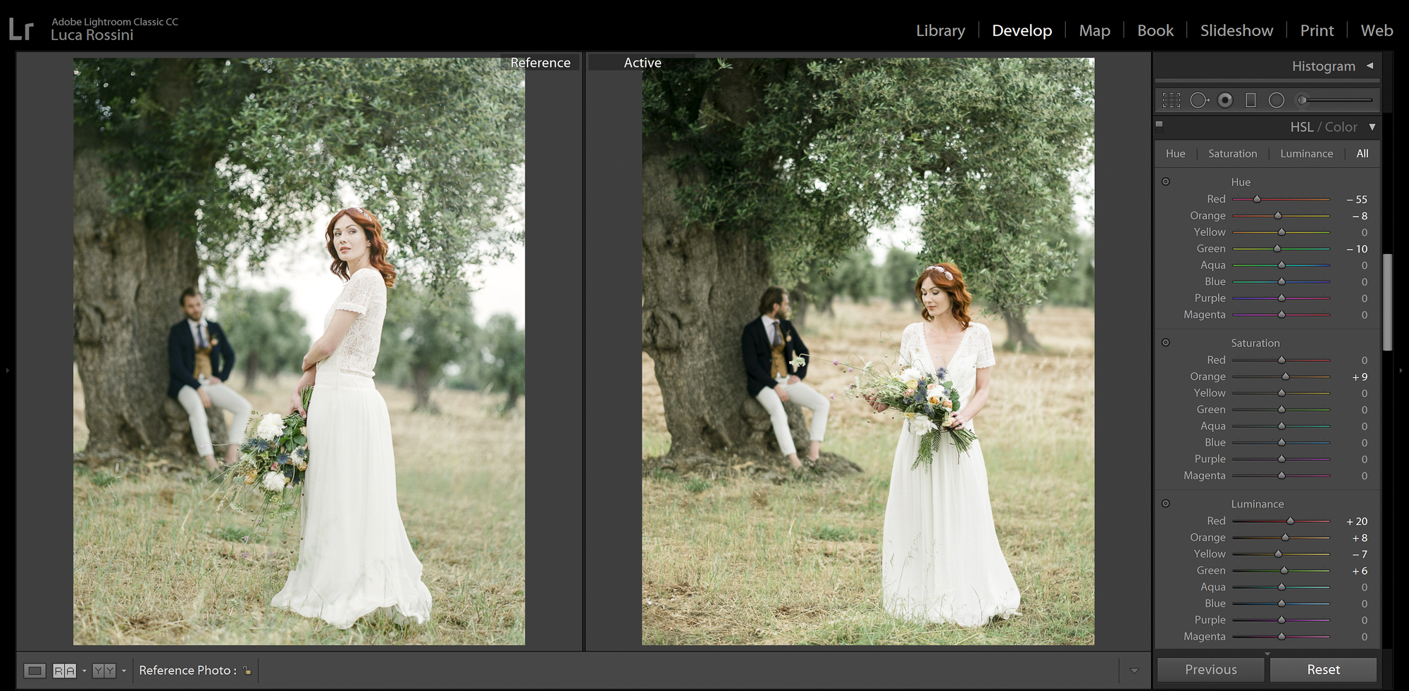
Matching colors’ luminance and tuning the reds with the HSL tool
While the colors are now almost identical, their luminance isn’t. The leaves of the olive tree are shinier, as the model’s red hair are, while the yellow of the dry leaves on the field in the background is a little darker. The color luminance is something we can’t tune with the Calibration tool, but luckily, HSL gives us access to the luminance of the single colors, as well as to their saturation and hue. I worked on the red, the orange, the yellow, and the green, until I got to a point where the overall image really looks close to the 400H look.
Adding grain with the Effects tool
What now comes to the eyes, at a close look, is the texture. The 400H has this delicate grain, as a good medium format film at 400 ISO should have. If you compare this grain to a 35mm film at 400ISO, it will seem almost non-existent, and that’s why professionals always used the medium format in the film age. But, for as little as it is, it’s there, where the digital file has none at all. Let’s go to the Effects tool and add some!

Reducing corners sharpness and contrast with a Radial Filter
As the final step, let’s look at the 400H film photo and let’s try to spot any “inconsistency” in the way colors and contrasts are rendered throughout the frame. In the early days (well before the “Olympic Games on Pixel Peeping”), people where calling such inconsistencies “character”. Let’s try to mimic the character: the corners of the film photo have less contrast and less definition. This basically means that the film (or the lens, actually most probably the lens) has corners issues. So, we’ll create one radial filter, reducing contrast, saturation, sharpness, clarity, only on the corners.
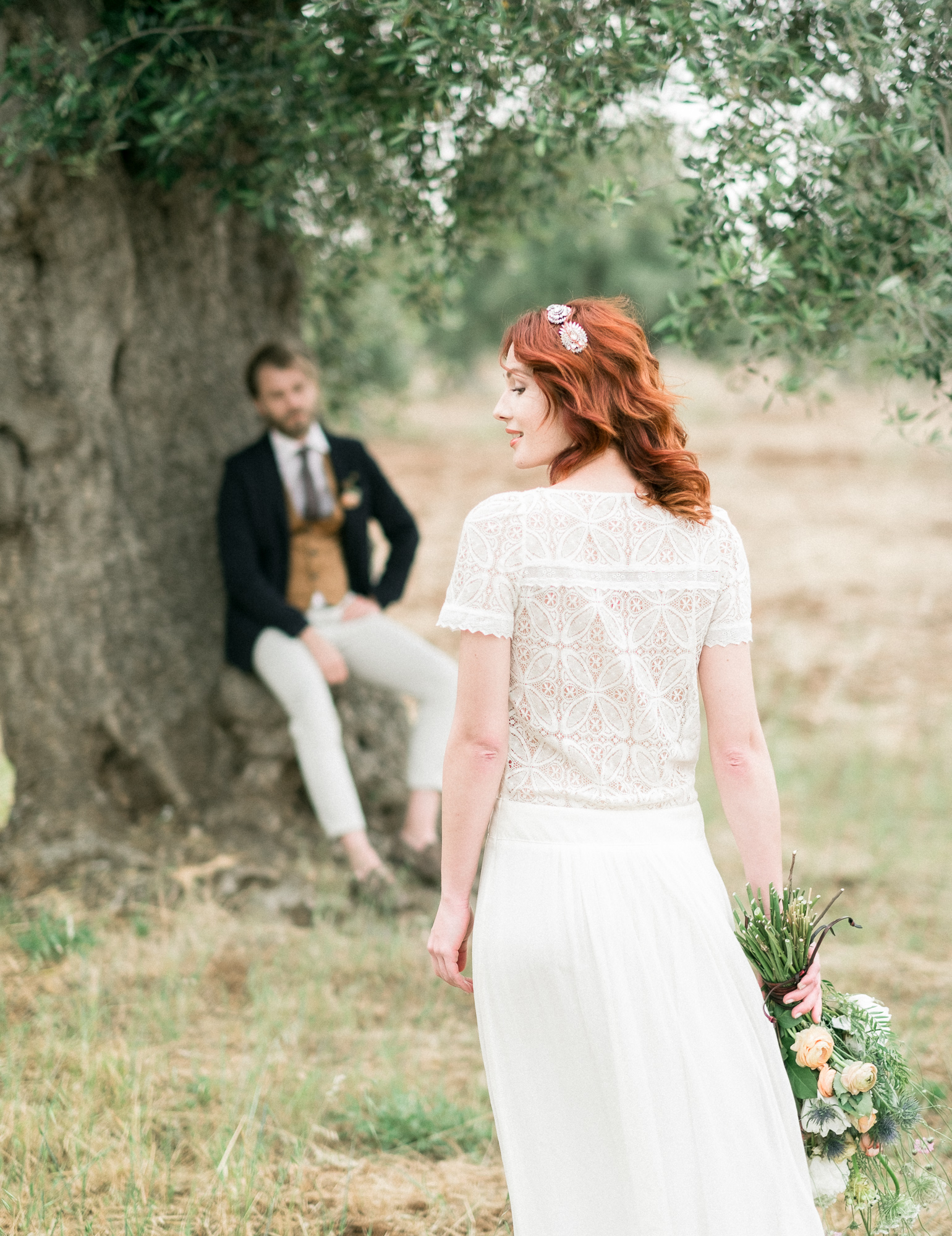
The X-T20 shot post-produced solely by applying the 400H film filter
So, here’s the final photo, together with a few others on which I just applied the new Fuji 400H filter. I really like the mood of this filter! You can download it from here, if you want, but I would suggest you to recreate it by yourself, you can gather all the needed info by looking at the pictures in this article. This way you might making it even better, with just some little changes here and there. If you do, please share you changes here in the comments, so we can all have better tools for our beloved photos!