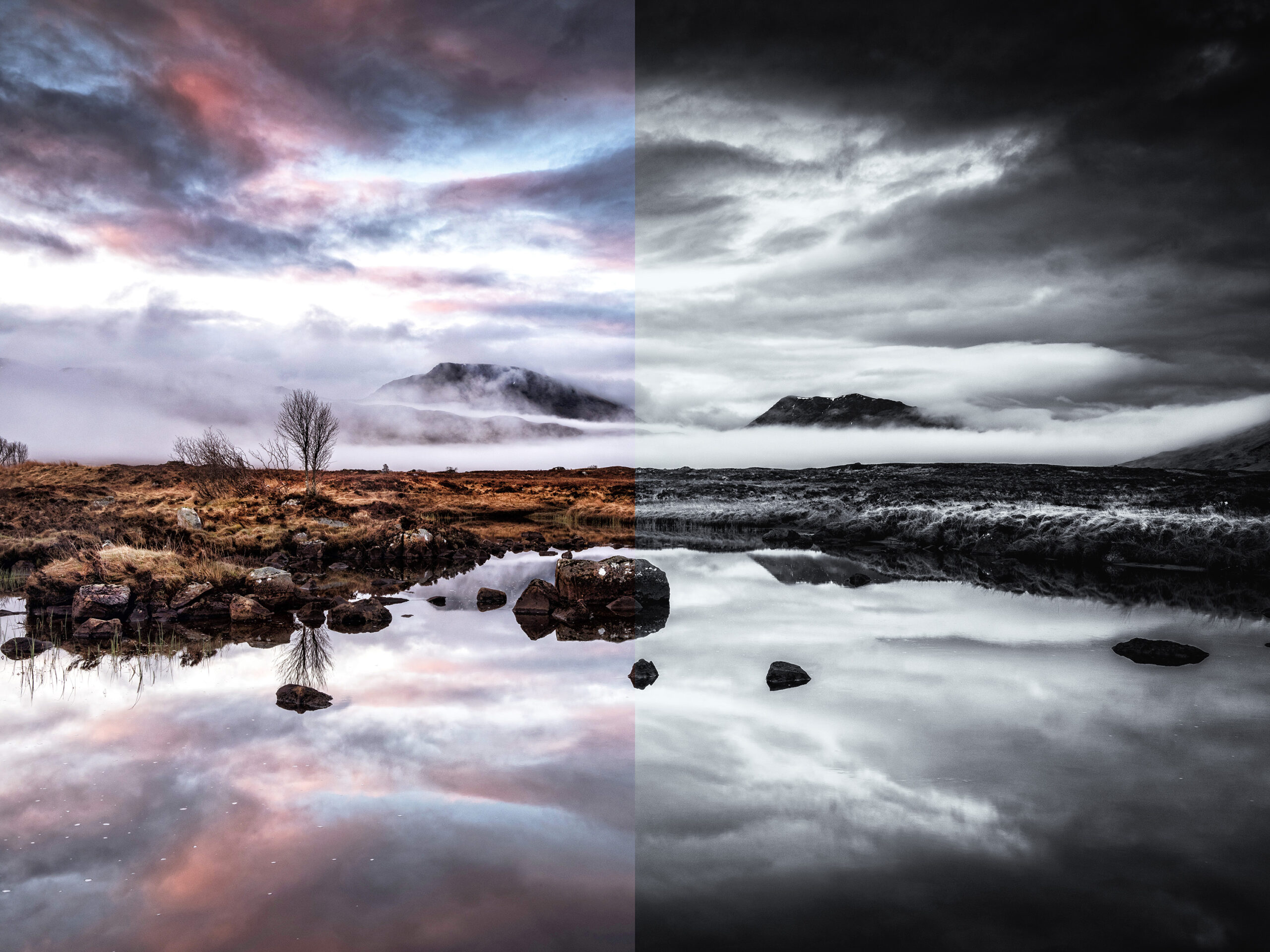
Black and white or colour? Now this is a question I see again and again across social media and to be honest there is no ‘black and white’ answer (excuse the obvious pun), it really depends on the image and what the photographer is trying to convey. While black and white works across many photographic genres, it lends itself extremely well to landscapes.
So why use monochrome when the world around us is in colour?
Colour in an image can be very dominant and can overpower the other elements such as tonal contrast, texture, shape, form and the quality of the light. By removing the colour you can see these other elements more clearly and this can make the image stronger.
I have been taking landscape images for over 30 years and had my own darkroom when I shot film. I used to spend hours working on black and white prints, perfecting the images I took. Many of the techniques I learned with film and film processing have transferred to the digital era. I treat my computer like a digital darkroom, using dodging, burning and toning techniques I learned 20 to 30 year ago. I actually find the digital darkroom much more enjoyable and better for my health.
I shoot both colour and black and white landscape images. When I set up my tripod I assess each scene and decide which I will use. I shoot the images in RAW and JPEG and tend to shoot in colour but ‘see’ the image in monochrome in my mind. I look for strong, contrasty light with shapes and textures.
I sometimes switch the JPEG setting to ACROS (R) so I can see the black and white image in the viewfinder but I find I am never satisfied with the shot straight out of the camera, much preferring to work on the final image in Photoshop using NIK Silver EFEX Pro2 software.
Whether you shoot a landscape in colour or black and white the composition has to be good. There is some misconception that converting a poor colour image to monochrome will suddenly make it much better; make it more ‘arty’. The composition and lighting of an image should stand up in either colour or black and white. If the lighting is flat and boring in colour it will be boring in black and white, the colours converting to several shades of grey rather than a rich display of attractive tones. The same goes with the composition, if it is boring in colour – well you get my drift!
So let’s have a look at a few examples from the Highlands of Scotland, a place that I love to visit as often as I can. The scenes are shot in colour and converted to black and white and I will explain which I prefer and why.
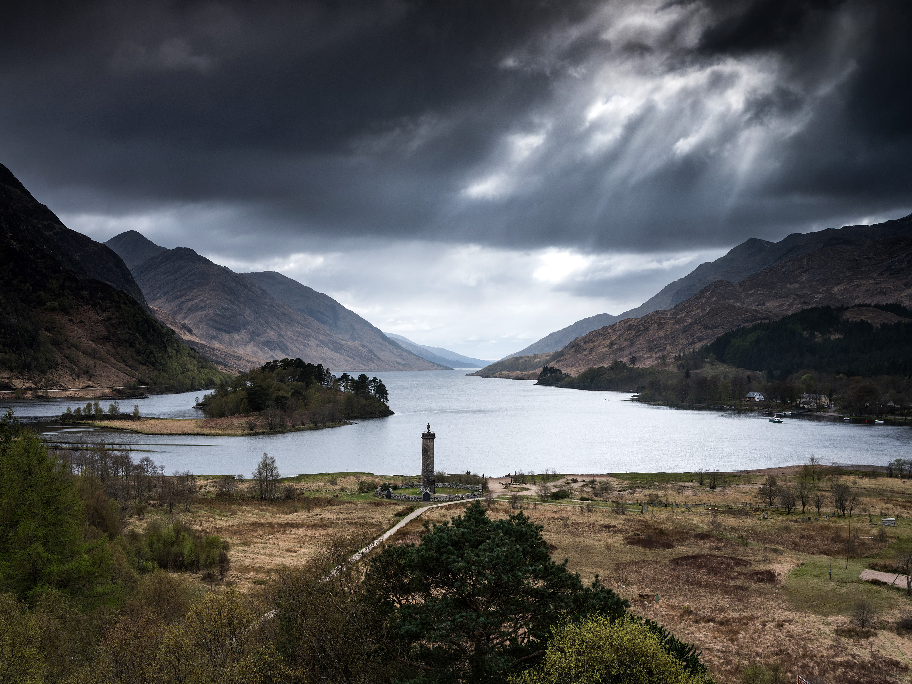
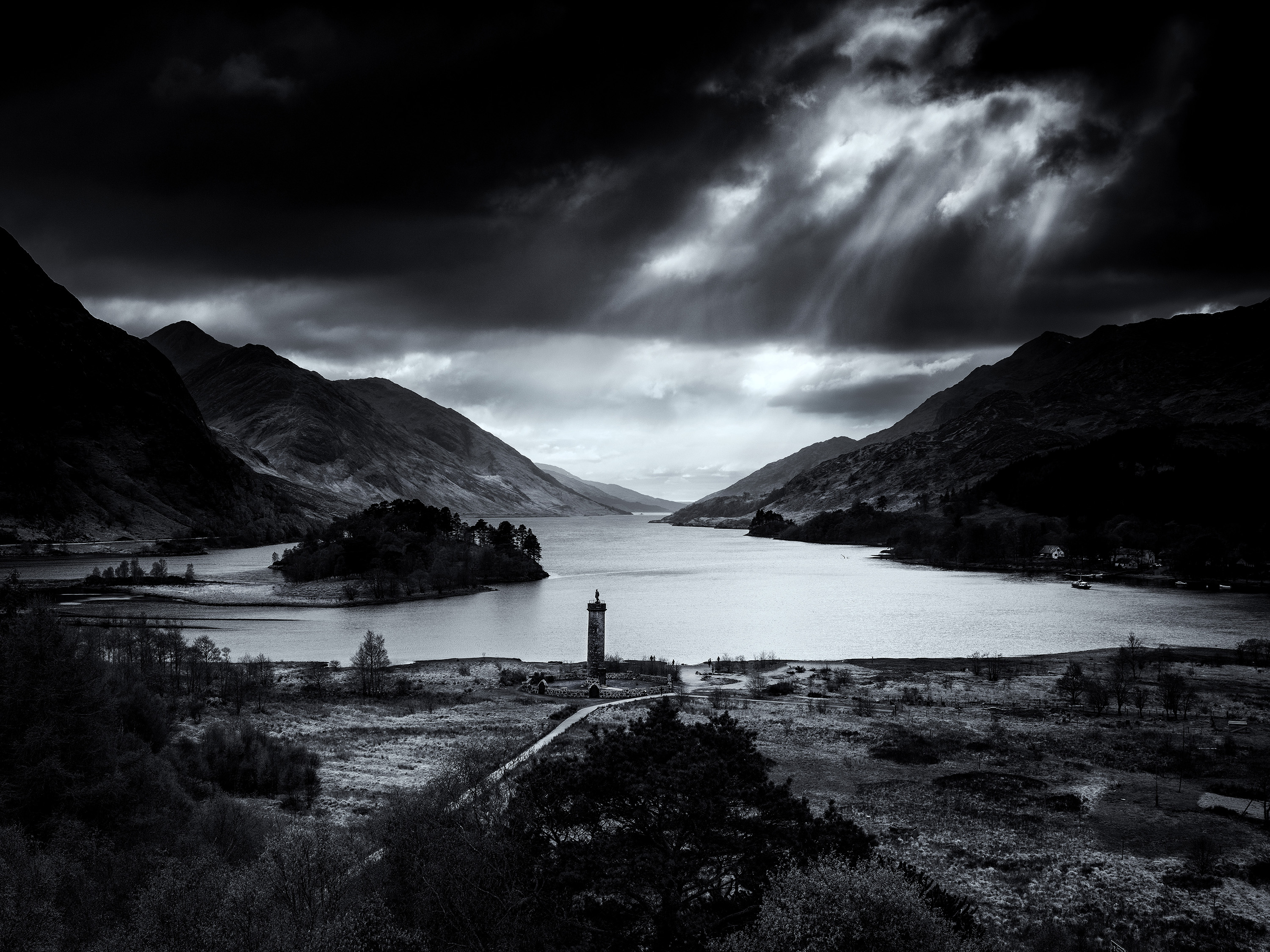
CLOUD BREAK AT GLENFINNAN
The first pair of images are from the Glenfinnan viewpoint overlooking Loch Shiel. This shot was taken in the late afternoon and the weather had turned to rain as I arrived. However I could see breaks in the cloud cover so I climbed to the top of the hill and waited for the weather to change. I waited an hour and my patience was rewarded with the sunlight breaking through the clouds over the loch.
The image was taken on a Fujifilm GFX50S and a GF32-64mm F4 lens fitted with a Lee 0.9 ND Soft Grad filter. The colour shot is OK but fails to convey the drama that I was seeing from the viewpoint. The black and white image conveys all the drama that is associated with the weather in Scottish Highlands.
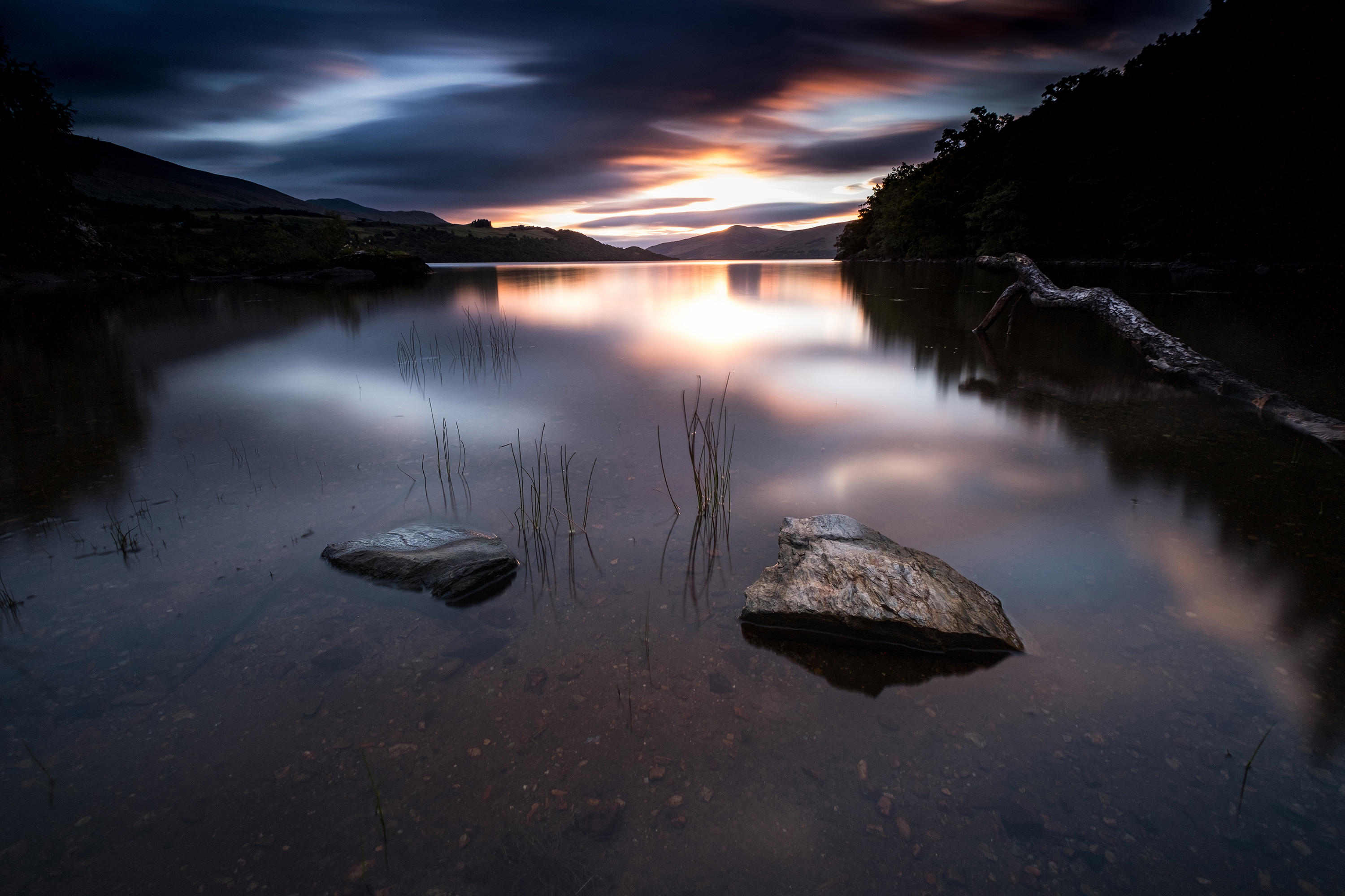
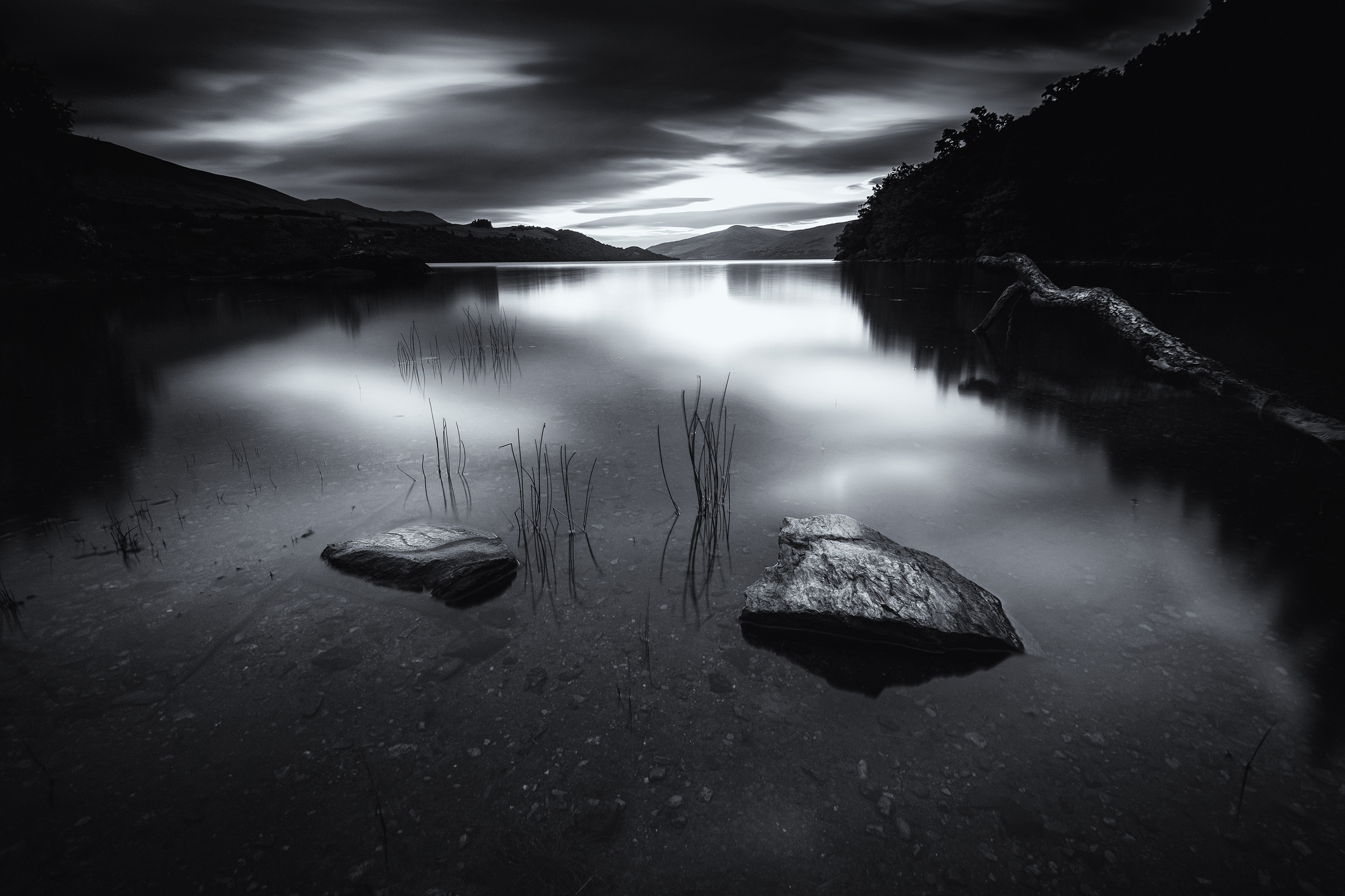
DAWN AT LOCH TAY
The second pair of images are from a dawn shot at Loch Tay. I set up the X-T2 and the XF10-24mm f4 lens on a tripod and set it low in the water using a pair of rocks in the shallows as foreground interest. I then just waited for the colours in the sky above the far mountains to change. The 180 second long exposure blurred the surface water of the loch and the clouds above.
My choice for these two images is the colour version. The subtle colours of the dawn is the primary factor and while the tone and textures in the mono version work really well, the colour version is my preference for this image.
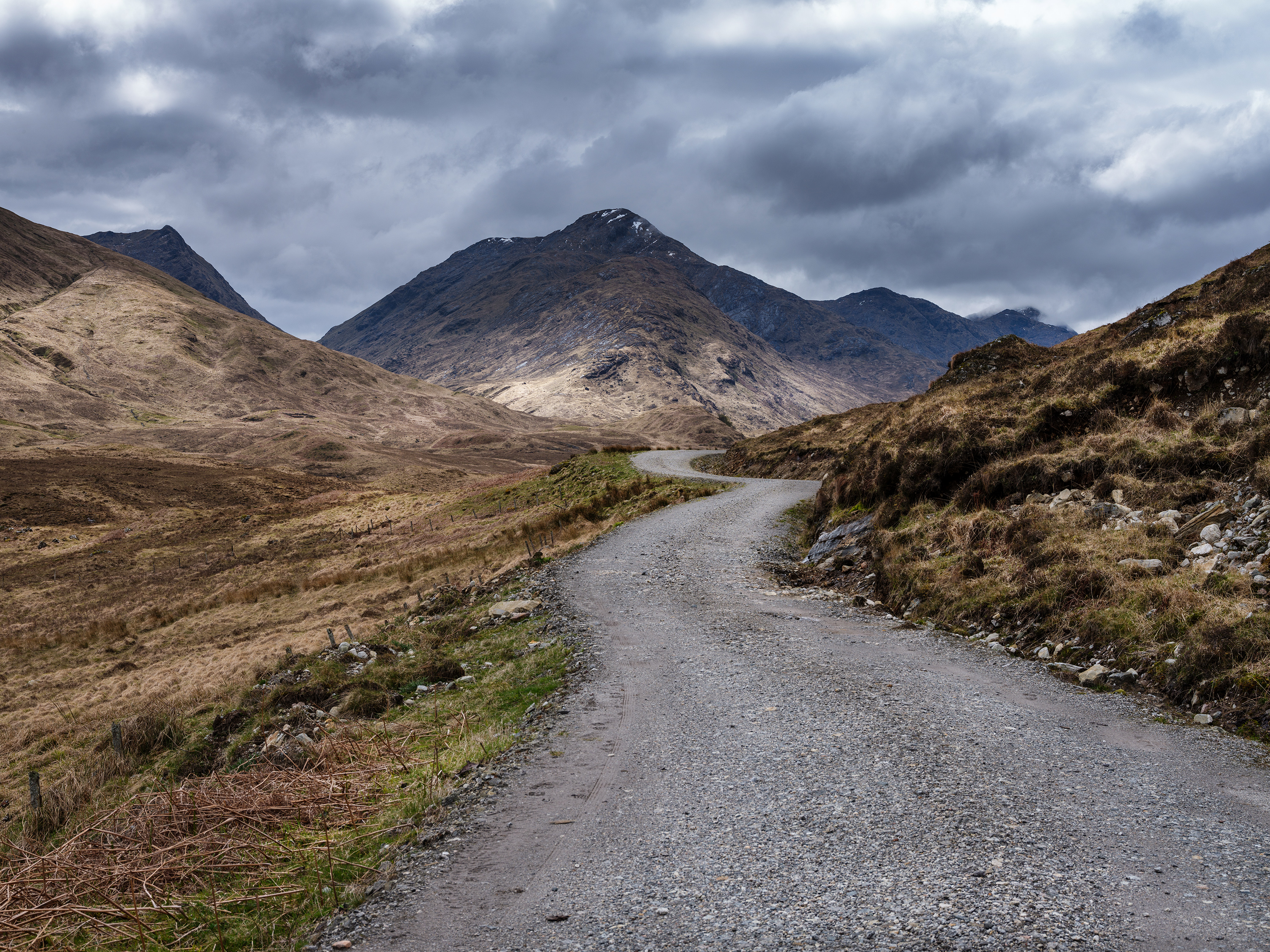
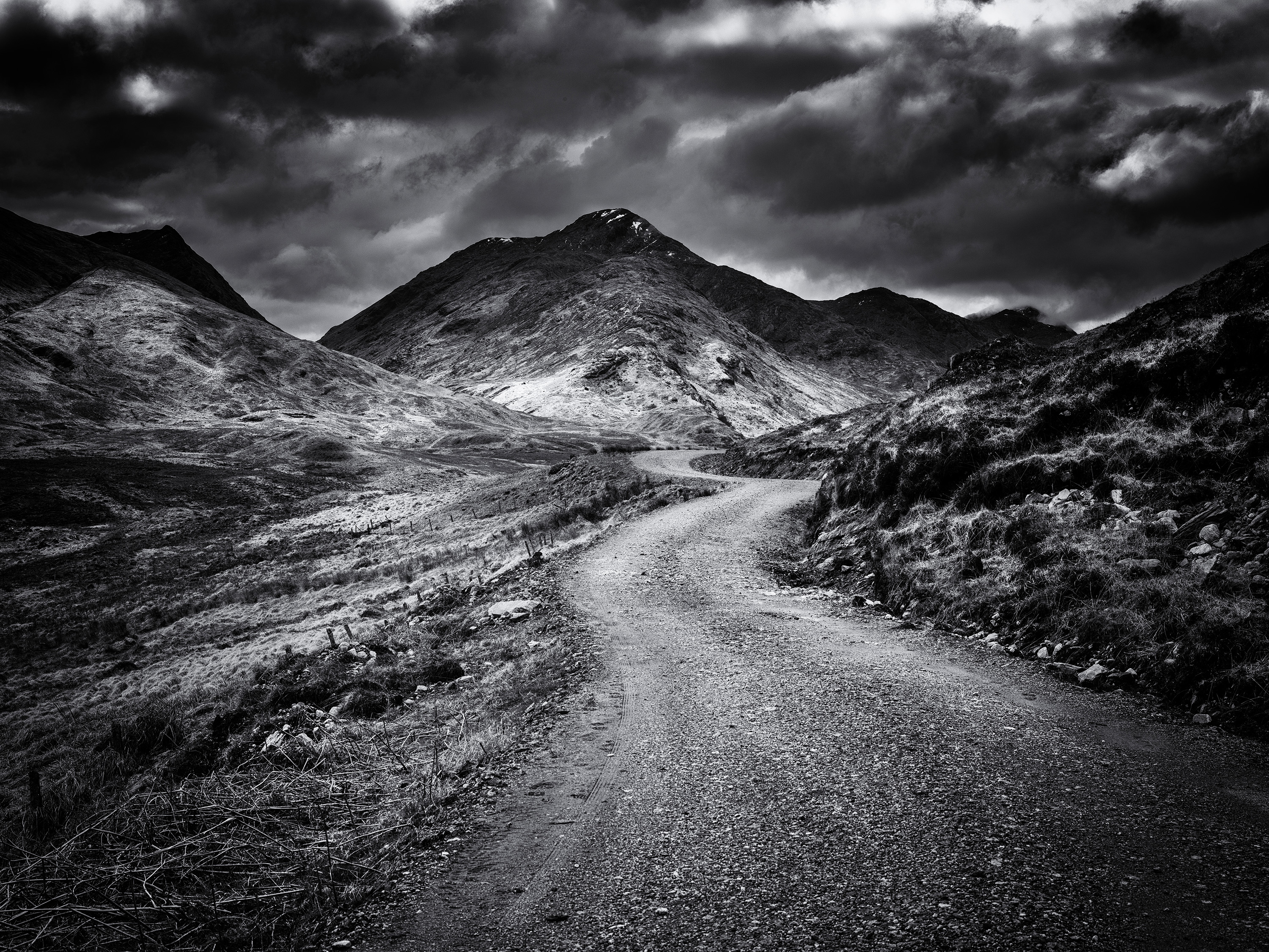
THE WINDING ROAD
I love using roads and paths as compositional aids and this image was taken north of Fort William. The tarmac road had come to an end and this gravel road led into the mountains. Using the GFX50S and GF32-64mm f4 lens I took this shot as the rain clouds started to gather over the mountain tops.
Like the shot at Glenfinnan, the monochrome image conveys the drama of the changing weather in the Highlands and this is how I saw this shot when I took it.
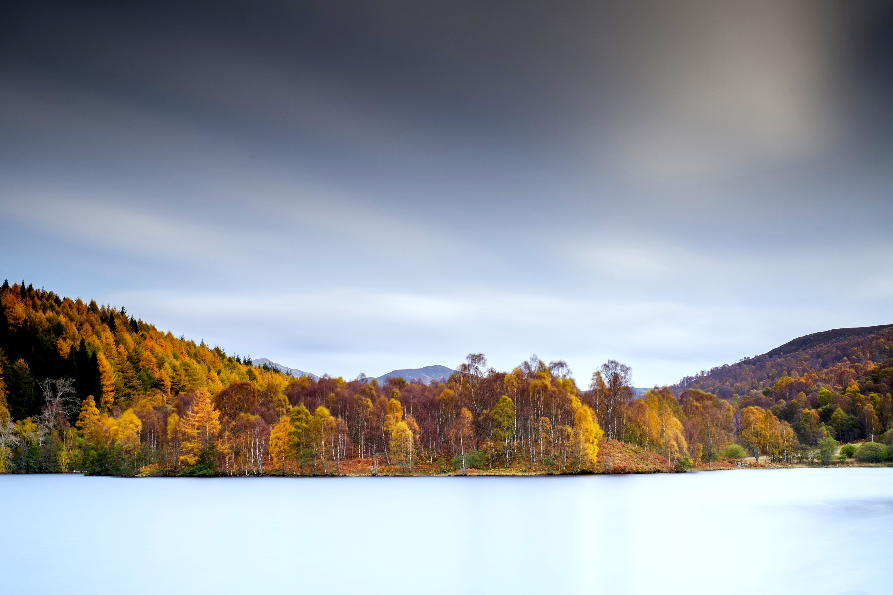
AUTUMN COLOURS
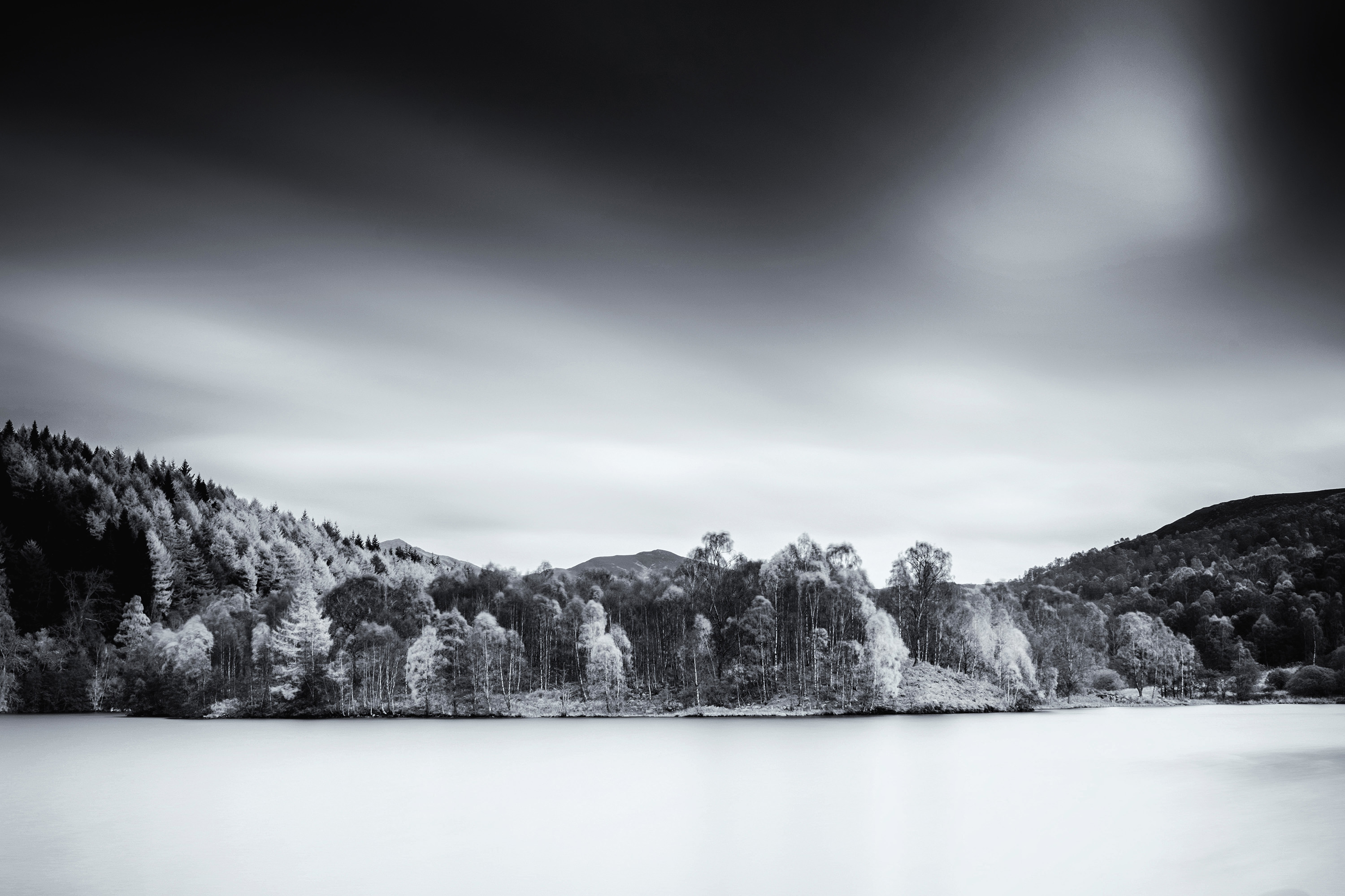
Autumn in the Highlands is wonderful with colour in the foliage contrasting with the bleak mountains. This shot at Loch Tummel was taken on the X-Pro2 with a XF16-55mm f2.8 fitted with a Lee 10x ND (Big Stopper) and a 0.9 ND Soft Grad filters. The long 126 second exposure has smoothed the water of the loch and blurred the clouds in the sky, which contrasts with the bright colours of the leaves in the trees on the edge of the loch.
I used a yellow filter during the black and white conversion, which has given an infrared feel to the image by turning the yellow trees white, which is a nice effect. But I was there to capture the autumn colours, so, unsurprisingly it is the colour version of the two that is my choice.
THE MOUNTAIN TOP
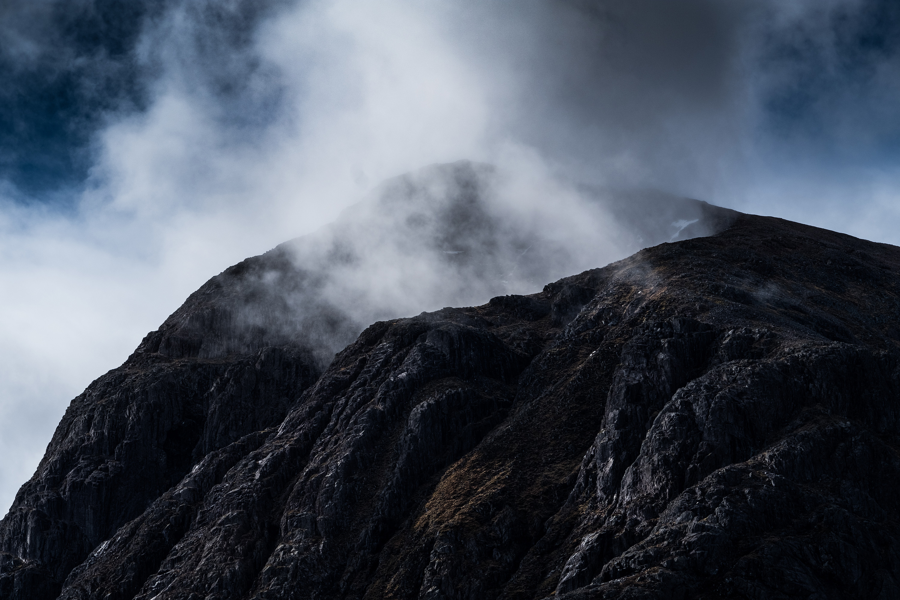
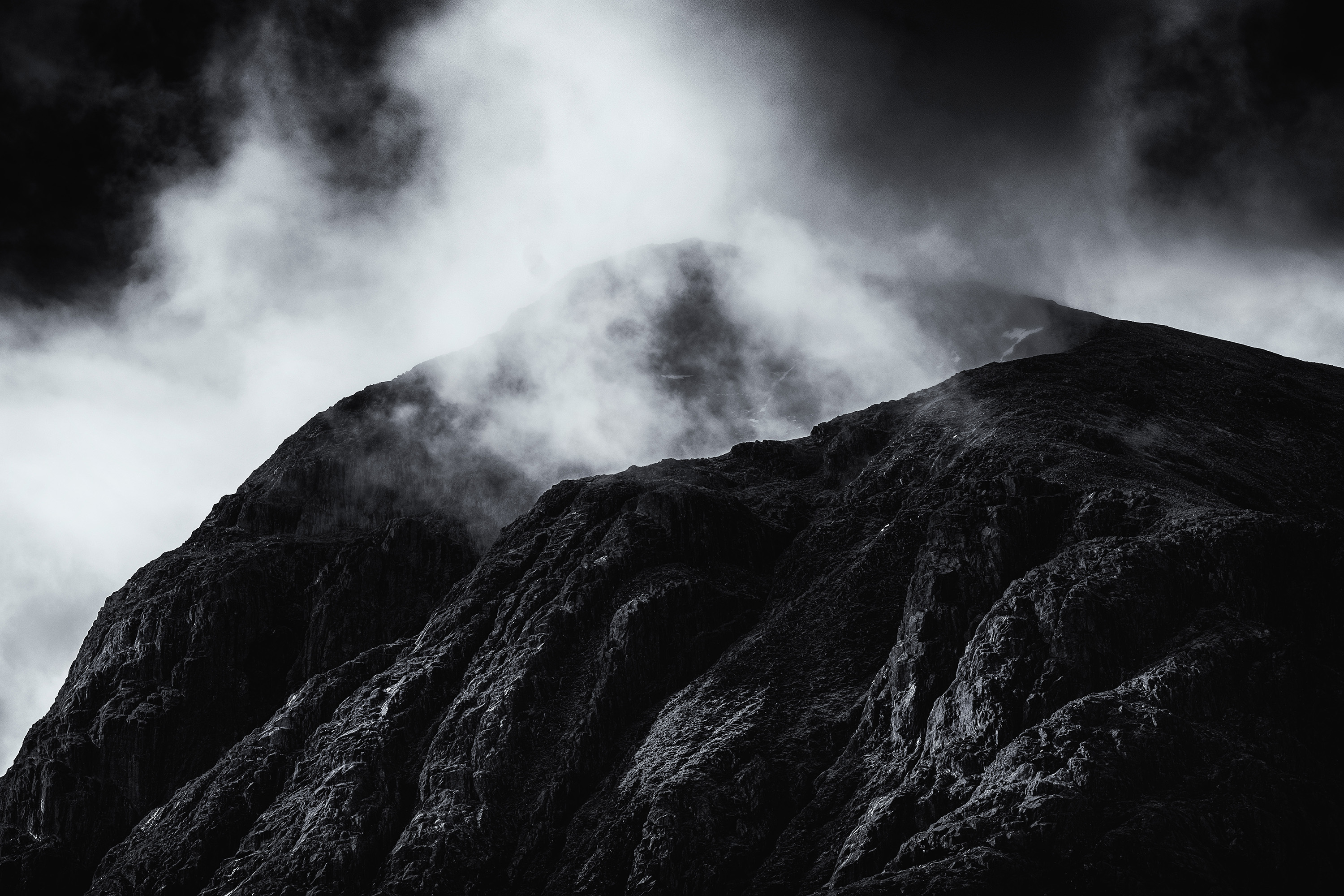
Landscapes are not just about using a wide angle lens to capture a sweeping vista, I love capturing the detail using a telephoto lens. While shooting in Glen Coe earlier this year the top of the Buachaille Etive Mor was shrouded in cloud but as I watched the clouds started to lift. Fitting the XF50-140mm f2.8 lens to the X-T2 I zoomed in on the top of the mountain and took a series of images as the clouds lifted.
The cliff faces on Buachaille Etive Mor are intimidating and the sunlight was reflecting off the rock faces showing the texture in the contasty light. The colour image is almost monochrome with just the browns of the vegetation clinging to the top of the mountain and the blue sky poking through the clouds providing any colour.
The monochrome image takes out these small colour elements concentrating the viewers attention on the tonal contrast and the textures in the image. Ansel Adams is an inspiration for me, like he is for many other landscape photographers, and I feel this black and white image emulates his work.
CONCLUSION
There is no right or wrong by choosing to use colour or black and white for landscape photography, in fact, you may disagree with my choices in the four examples I have used.
I love using black and white for my landscape photography, but not at the expense of an image that obviously works better in colour.

