
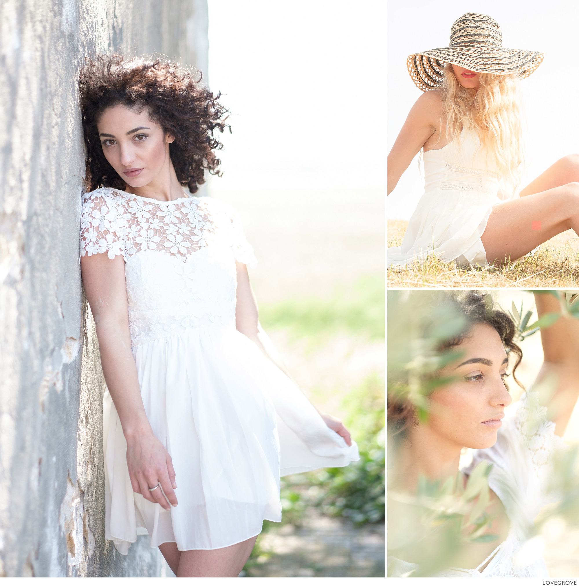
I love bright, zingy, pictures that sparkle and now with the quality and control of the LCD and EVF on Fujifilm X Series cameras, there is no reason not to reach for these top notes in images that say sunshine.
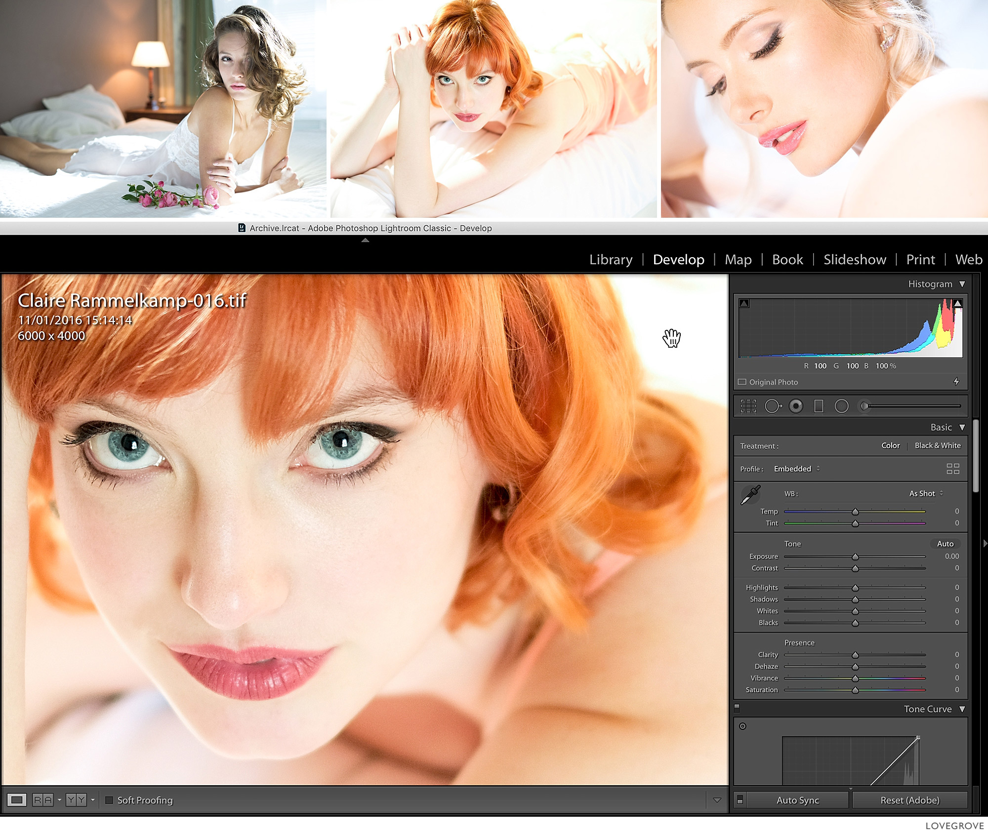
01. When you hover over a point in a photograph, the editing application usually gives you the RGB values. Here Lightroom is set to display percentages as shown just below the histogram. The little white triangle top right in the histogram shows that the highlights are blown out. If the shot looks good, it is good. Don’t be bullied by the software.
Why 255 and not 256? There are 256 levels of tone in an 8-bit file but because zero is one of the values that leaves just 255 for all the others. White is made up of 255 Red, 255 Green and 255 Blue. Our eyes can only determine about 100 steps on a greyscale so the 8 bits of JPEG files is fine for all output on print or screen.
02. Life is great when you can free yourself from the constraints of rules. I never consult a histogram at the taking stage. The histogram really is irrelevant. What matters is what the shot looks like. Set up your LCD or EVF in conjunction with your picture editing set-up (colour-managed screen with your choice of editing software) so that the screens give the same highlight and shadow information for your images and away you go. No surprises.
If the shot looks good it is good. Avoid histogram hysteria. What does the tech know about art anyway? Nothing.
Camera club judges and even some professional judges have it in for pure white. I’ve no idea why, as white is such a powerful tone. I’d rather see an area of pure white than a black hole in prints. Having said that, graphic images at both extremes are often lovable.

03. These shots were taken in my studio. What I love about studio work is everything is under the total control of the photographer. The quantity, direction and quality of the light, the exposure and the camera settings. The skin tones on the shoulders and tops of the arms in the top two pictures are beautifully blown. The shot bottom left has no pixels at white. I chose to use minimal contrast and let the shot scream, and pulled back the aperture by one click before shooting. The shot bottom right is lit with a spotlight from behind shining through a plastic palm tree and the rest of the illumination is from reflections and flare.

04. I can hear myself singing ‘Let it go, let it go’. It’s lucky you can’t. My advice is understand what part of your frame is important, expose for it and let the rest of the image go free.
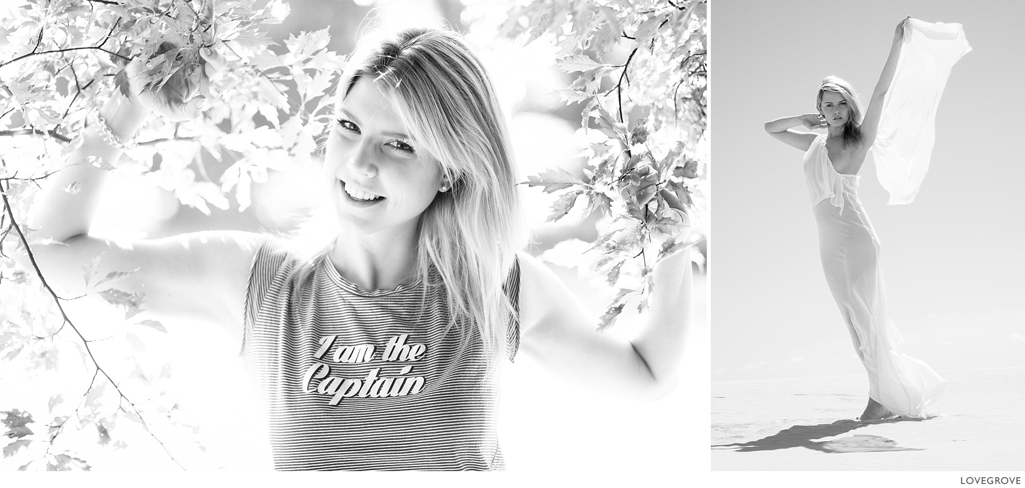
05. This technique of embracing pure white works wonders for monochrome prints too.
Push the exposure so hard the shot screams at you and then pull it back one click. What can possibly go wrong? Have fun and push the boundaries from time to time.